Chabot Collage
Brand Identity System
Chabot College is a community college serving a diverse student body, including many first-generation students pursuing higher education or vocational pathways. While the school has a strong and supportive internal culture, its external perception felt outdated and did not reflect the reality of the community.
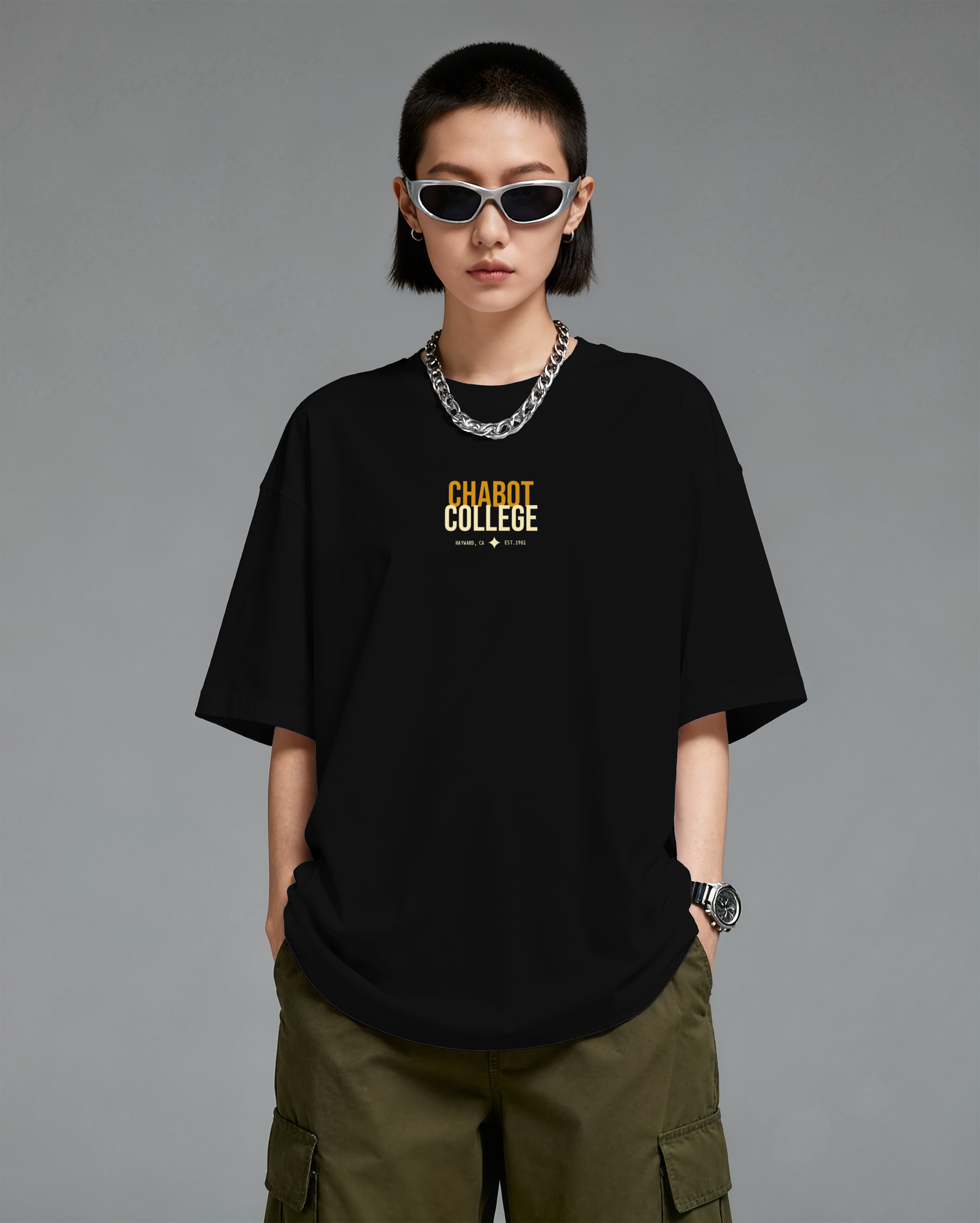
I led the concept for a modern visual identity system that was selected and developed in collaboration with my creative director. The goal was to reposition Chabot as a place that feels relevant, aspirational, and exciting to be part of, while remaining functional across institutional needs.
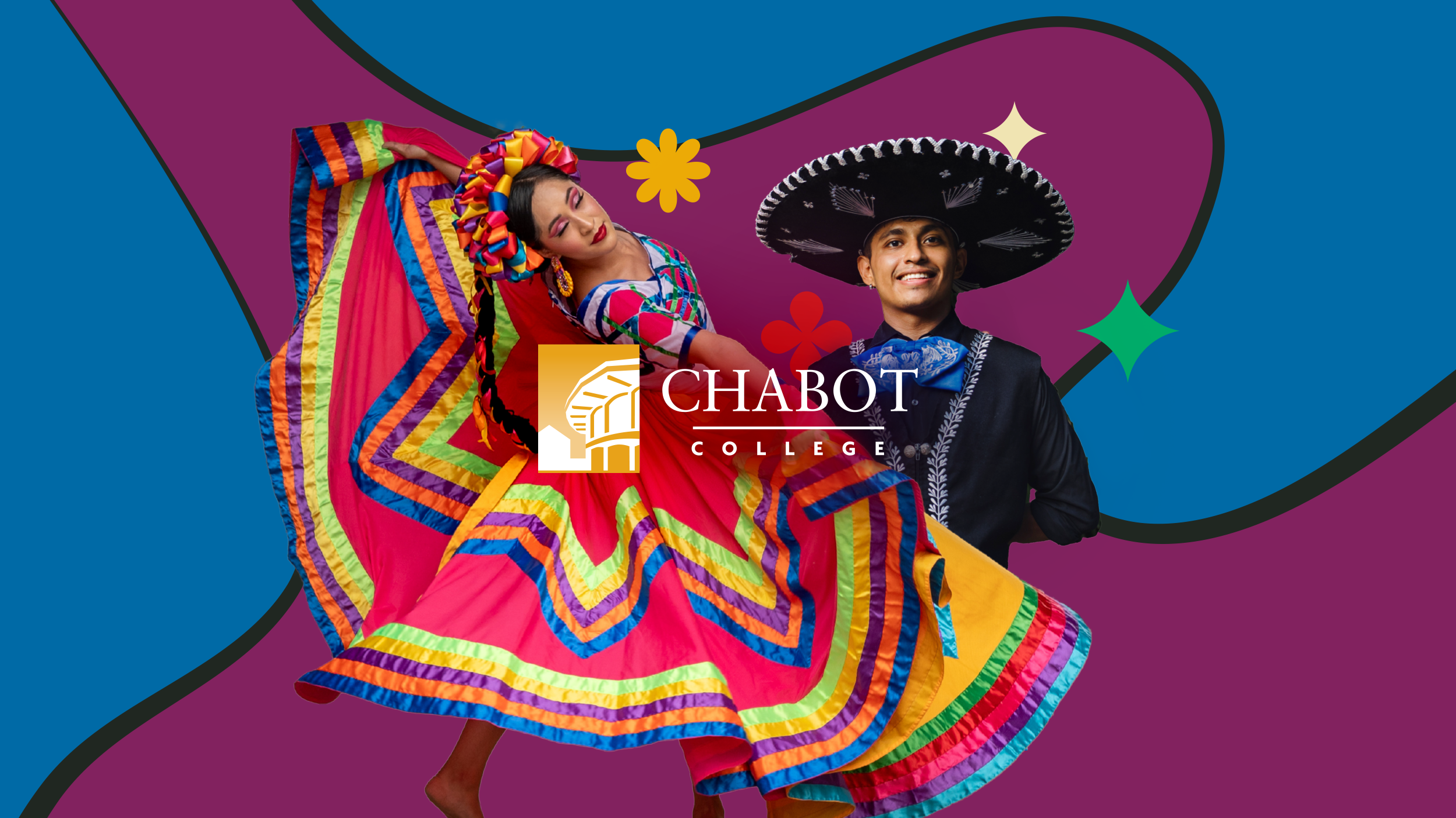
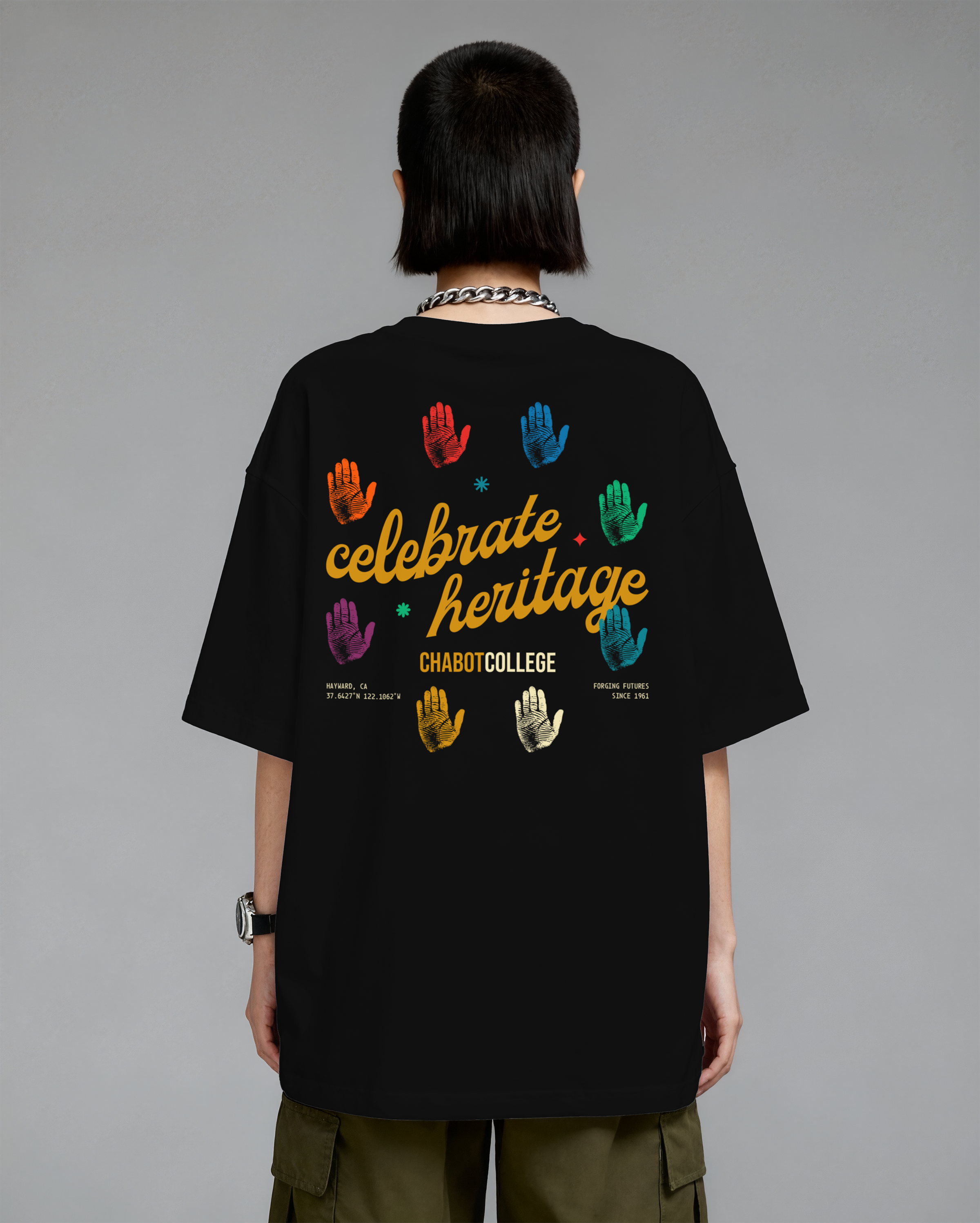
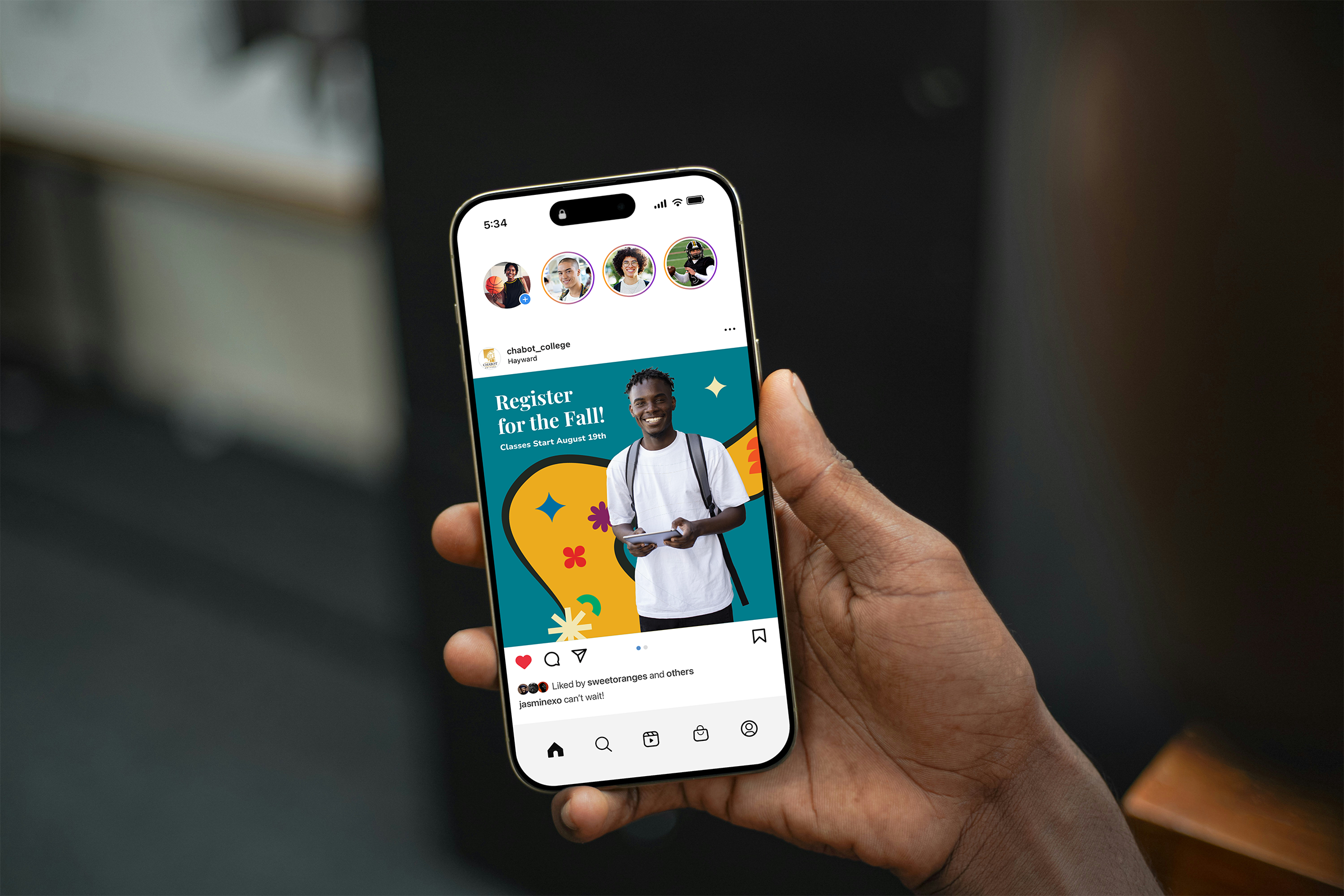
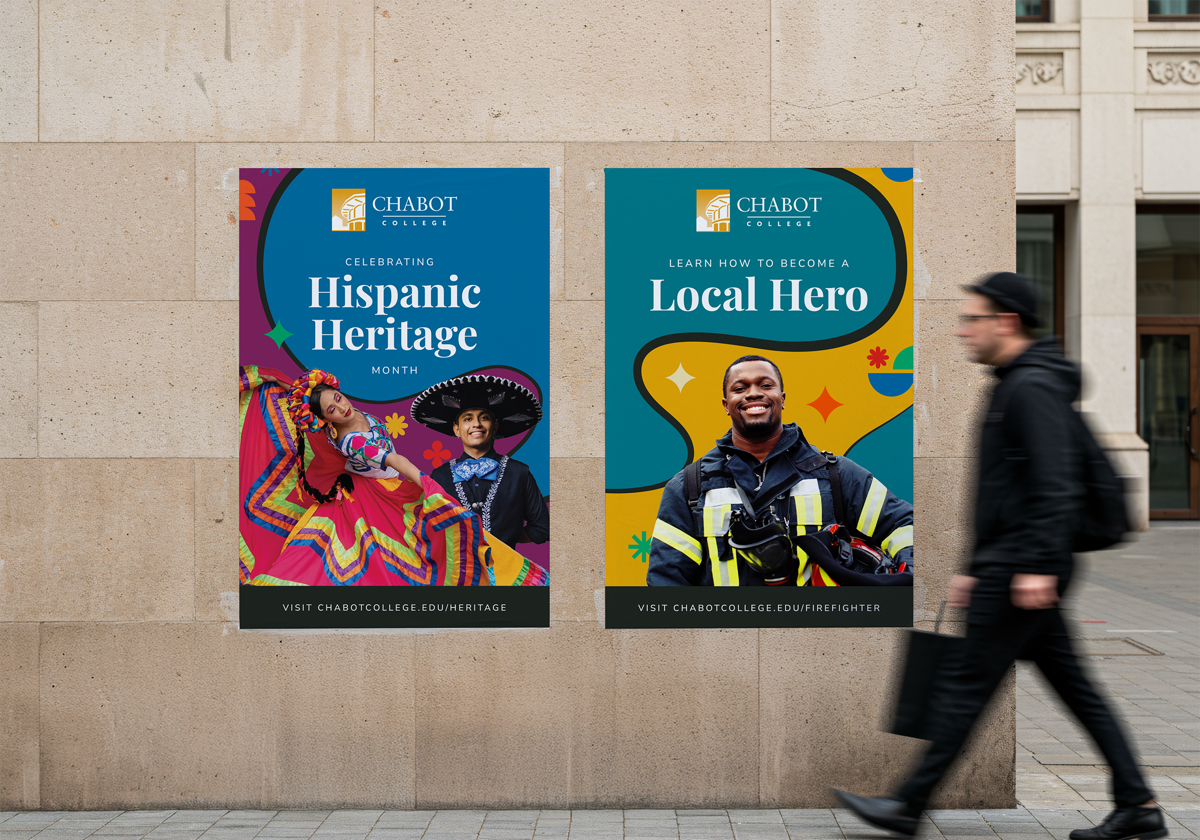
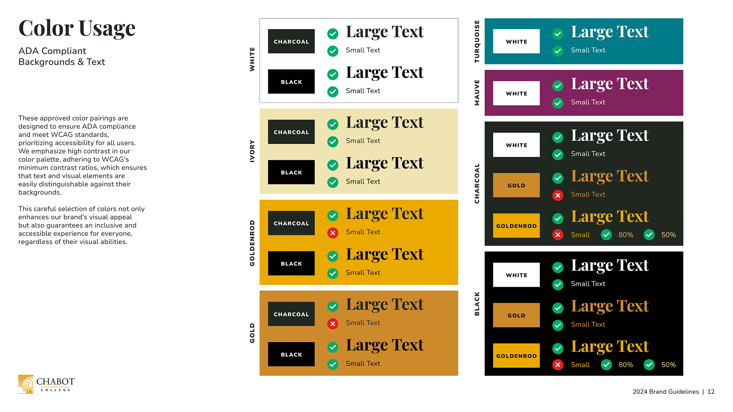
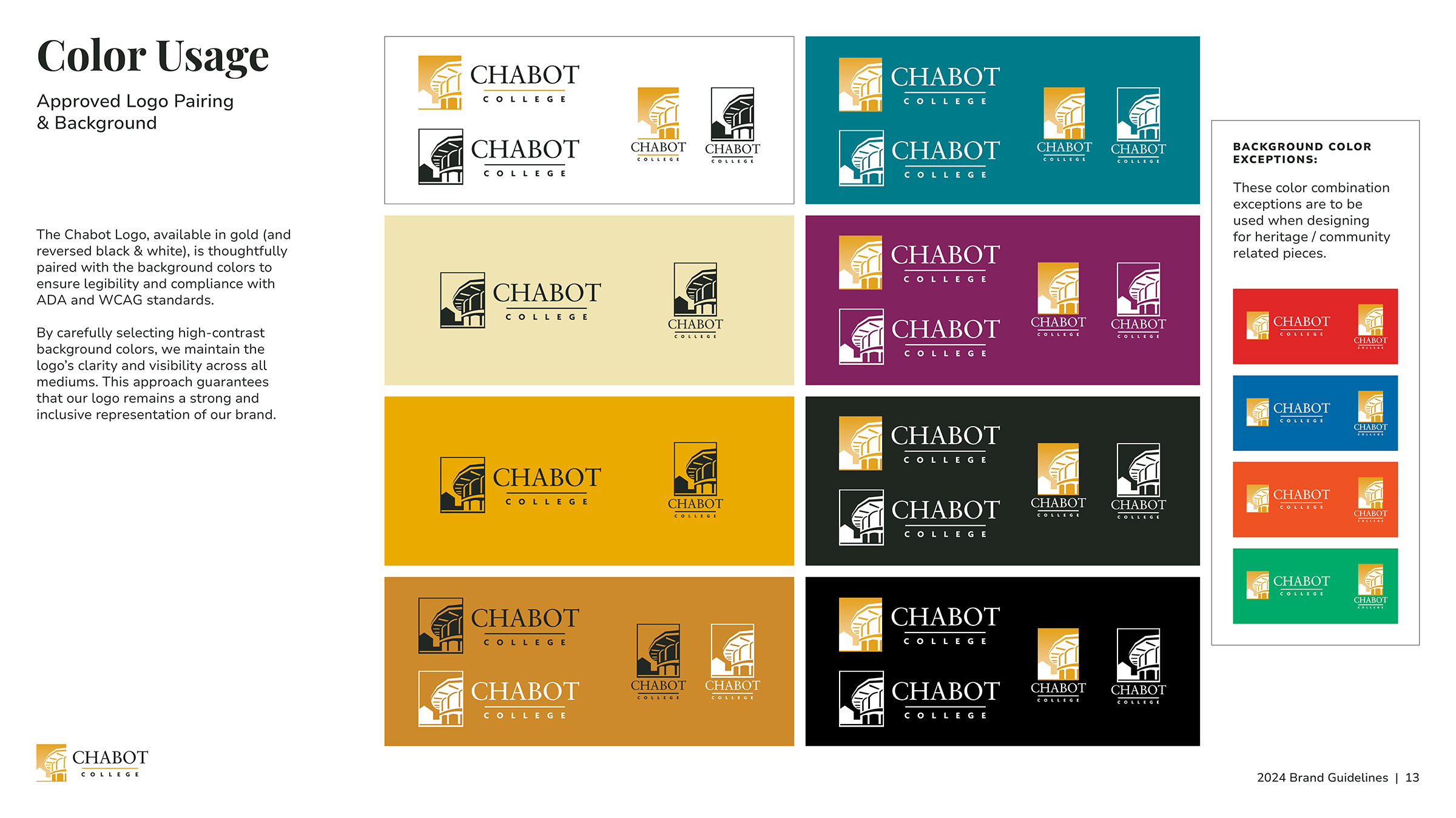
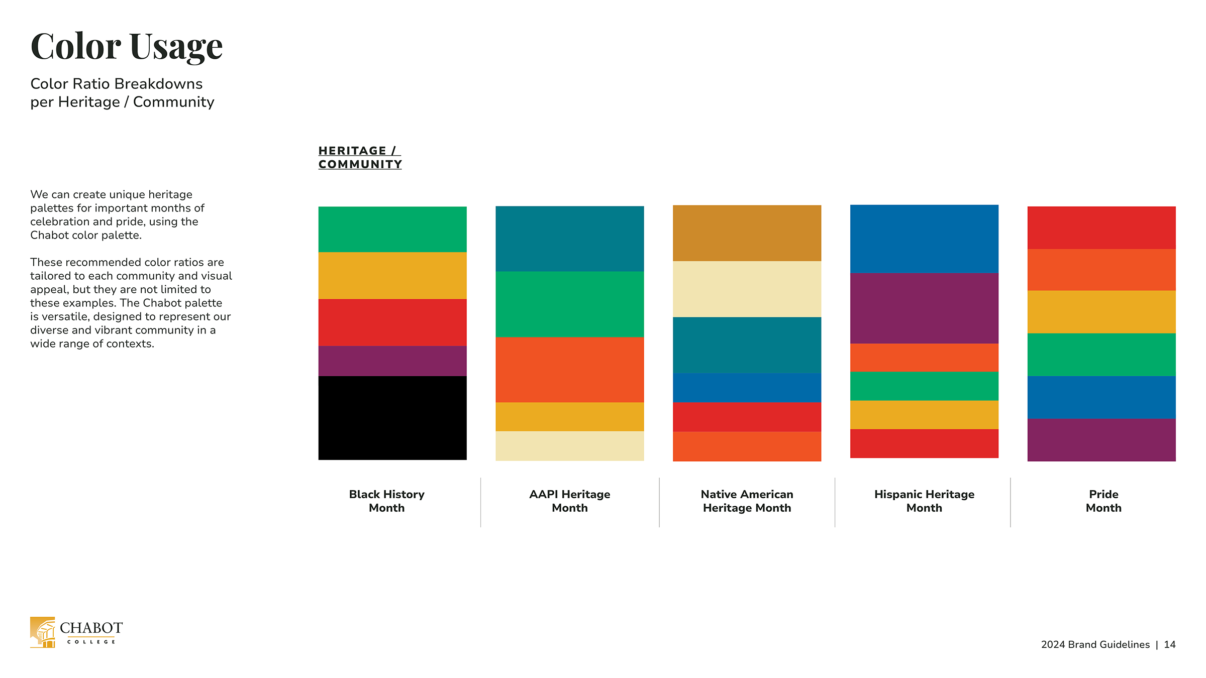
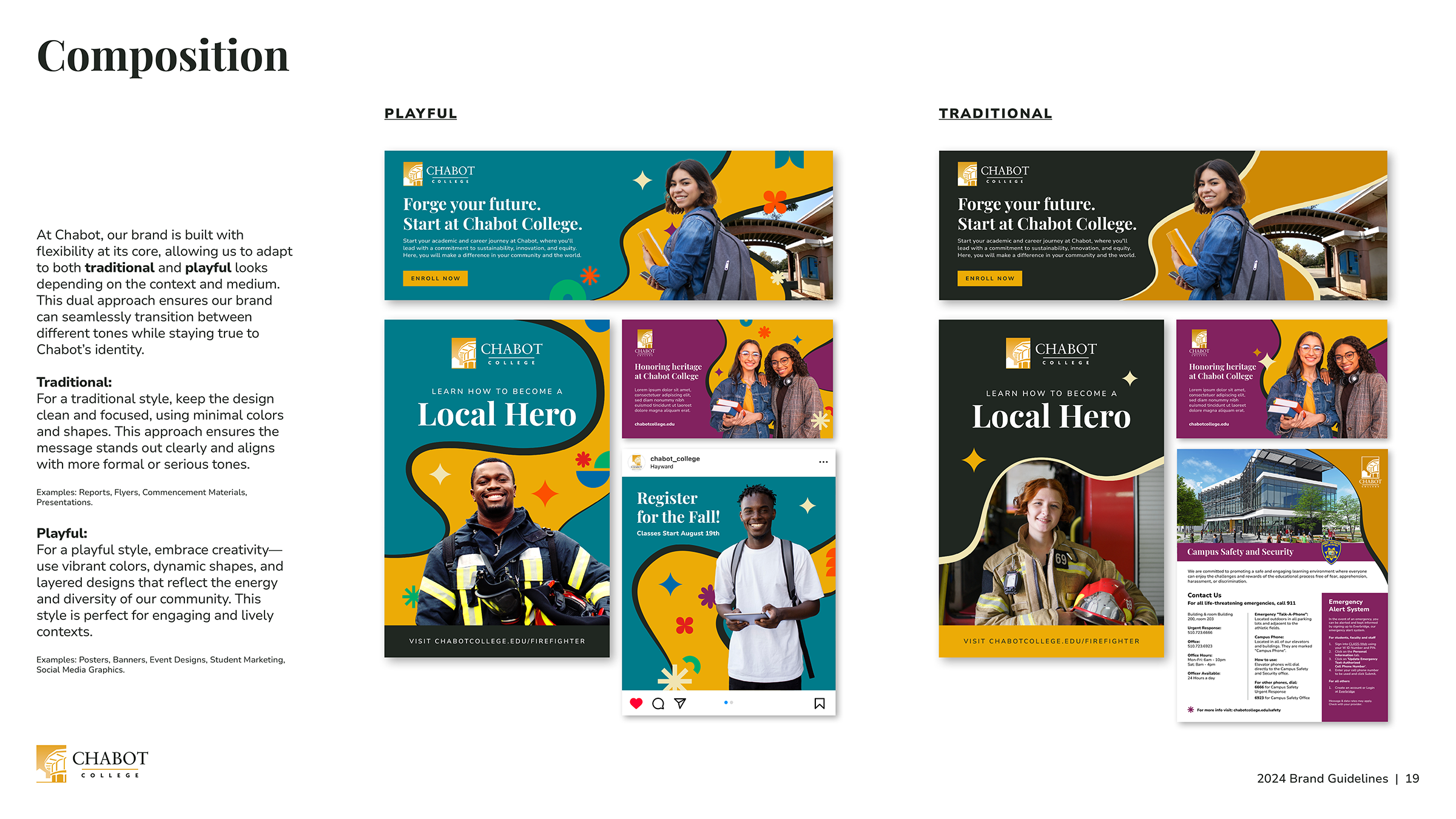
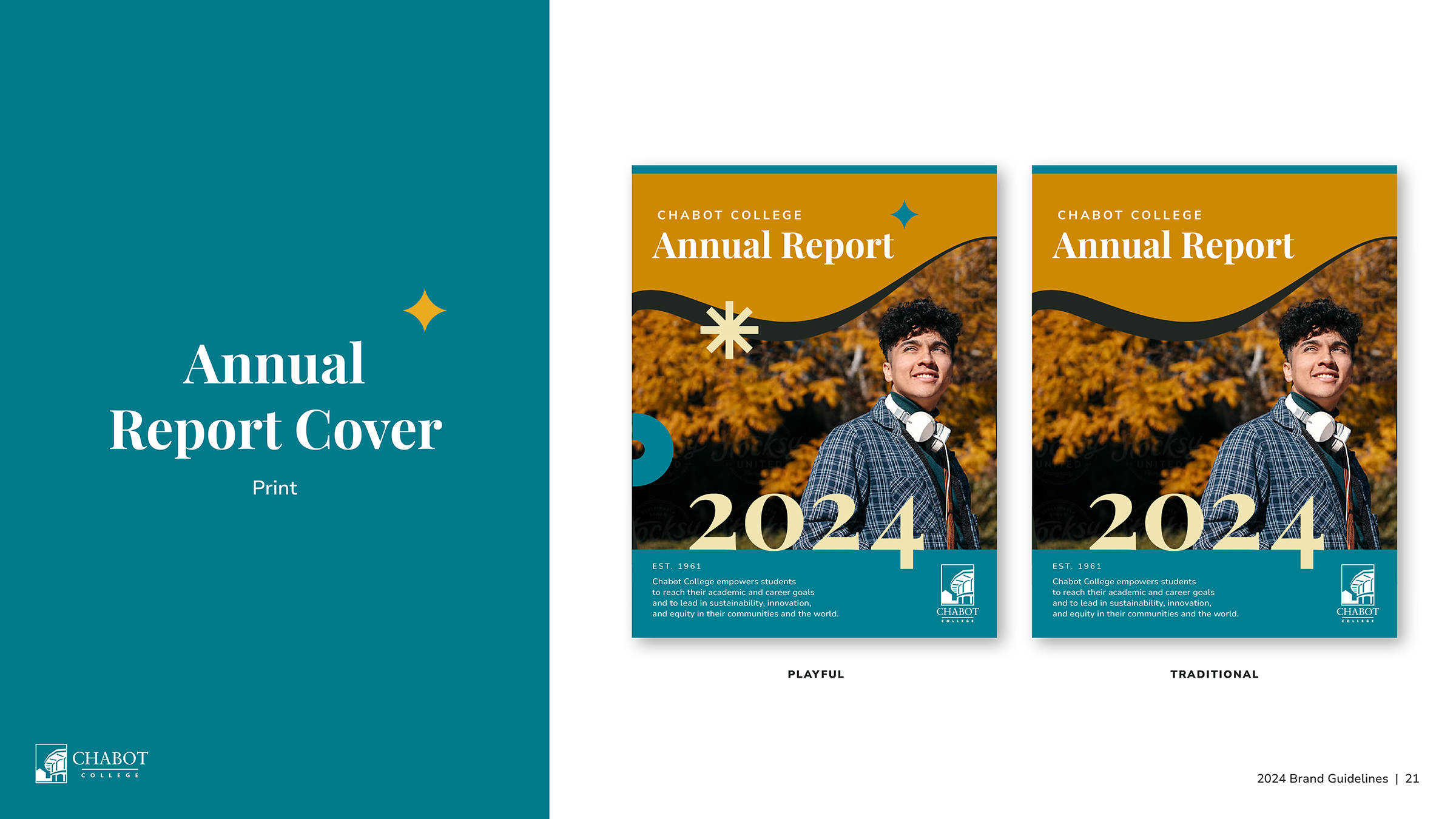
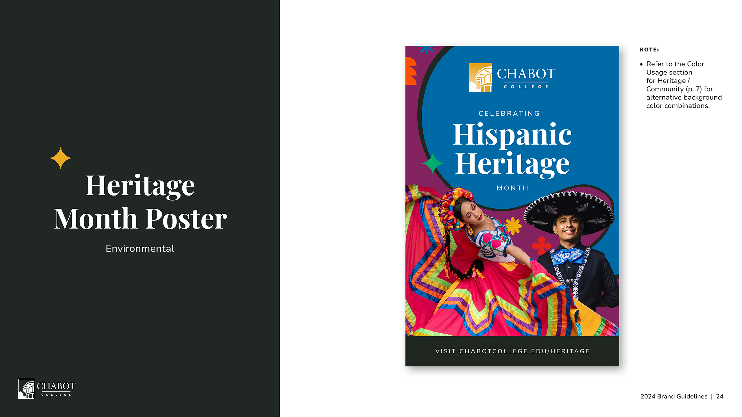
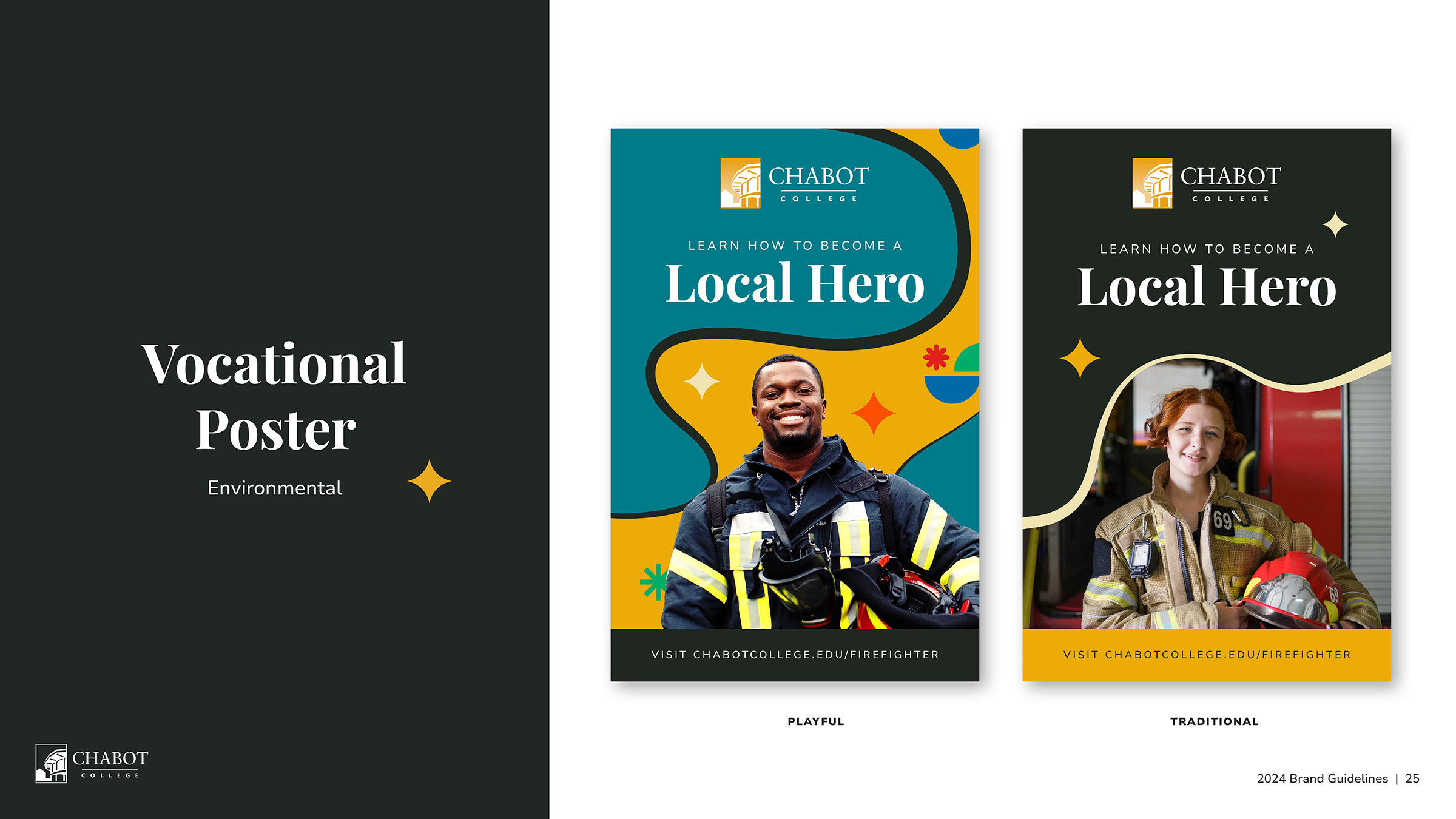
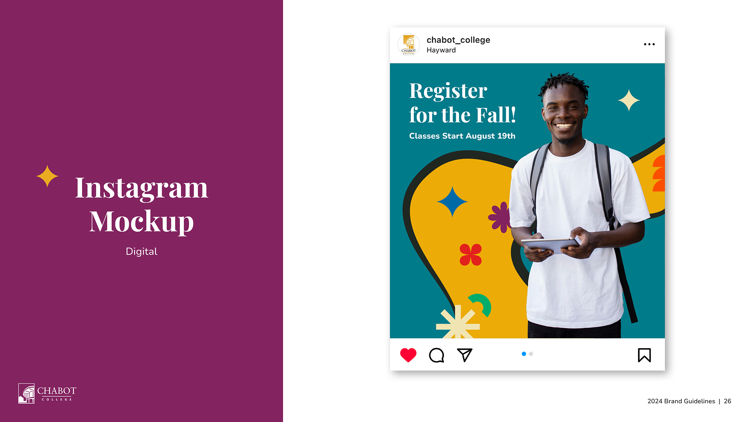
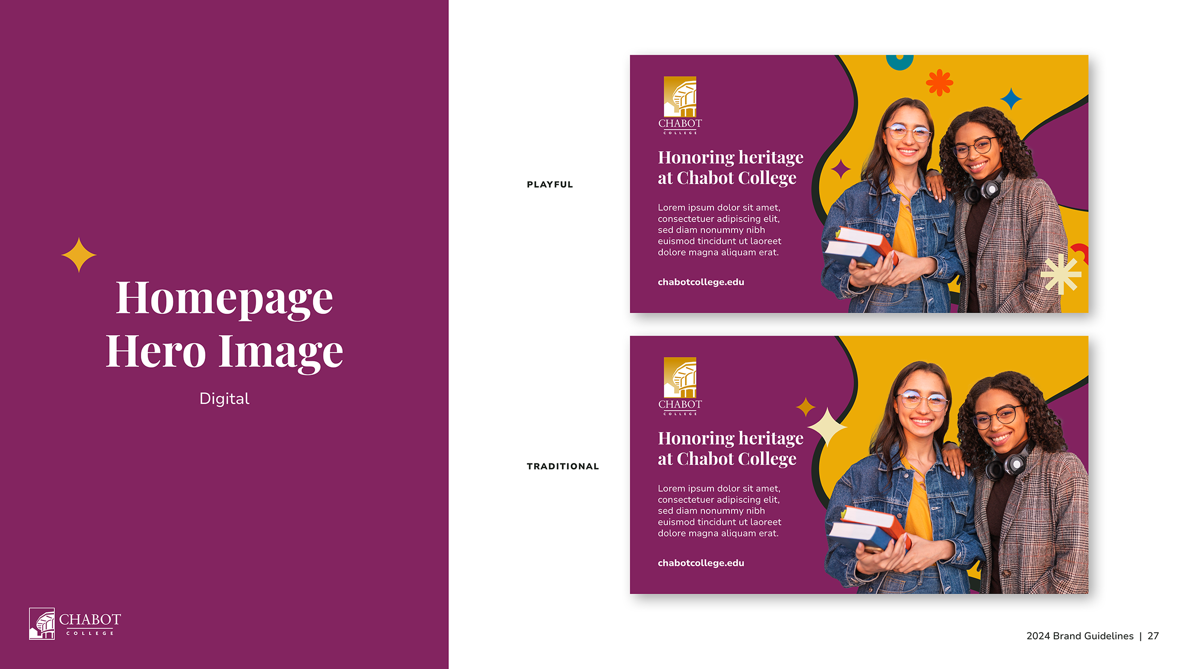
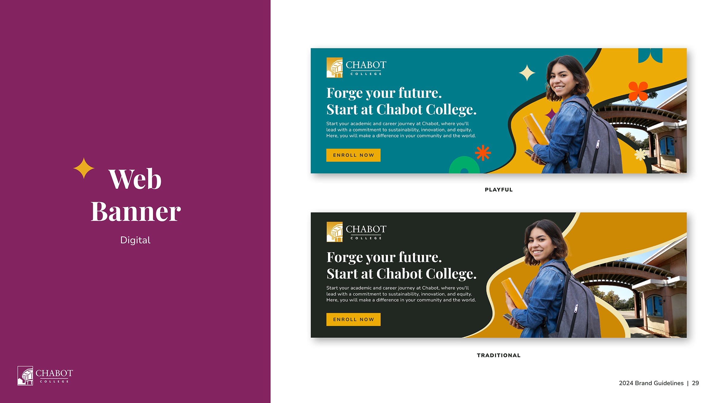
The system introduces a unified framework with two color-driven expressions, traditional and playful, allowing the brand to shift tone depending on context. A flexible color system tied to different communities and heritage moments supports this, along with graphic shapes and a path element that reference student journeys and growth.
The result is a brand that feels current, inclusive, and aligned with the experience of being part of Chabot.
-
Client: Chabot College
Role: Sr. Art Direction & Design
Year: 2024
-
Credits:
Creative Director: Marissa Fine MarcusPrograms:
Ai, PS, INDD


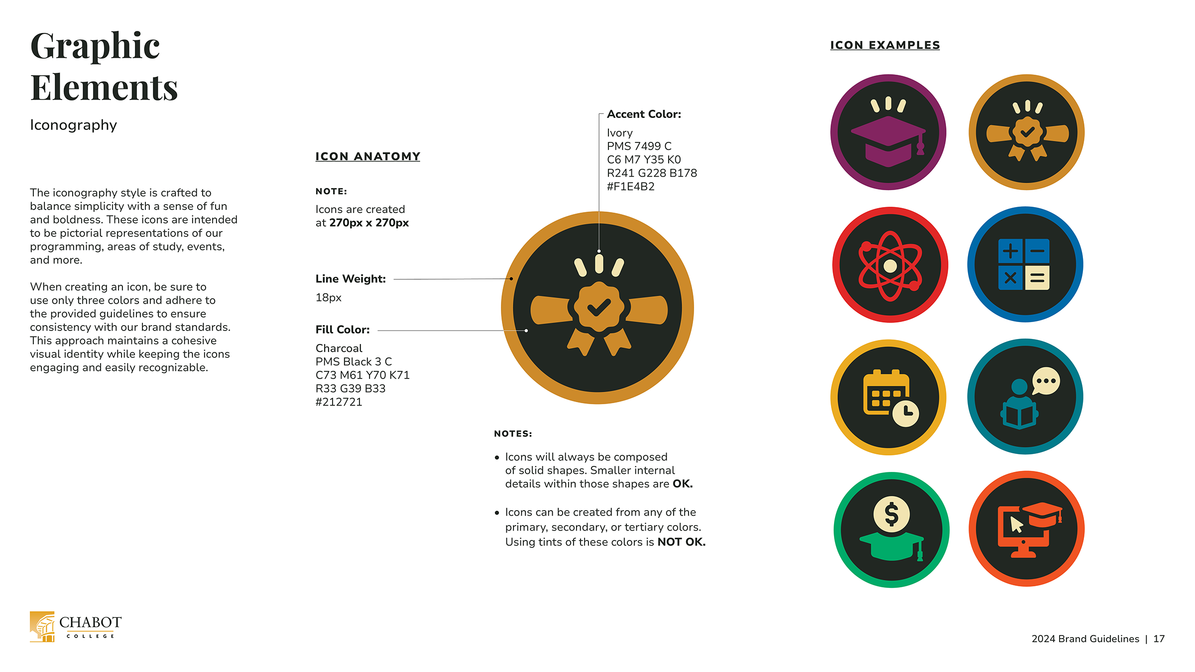

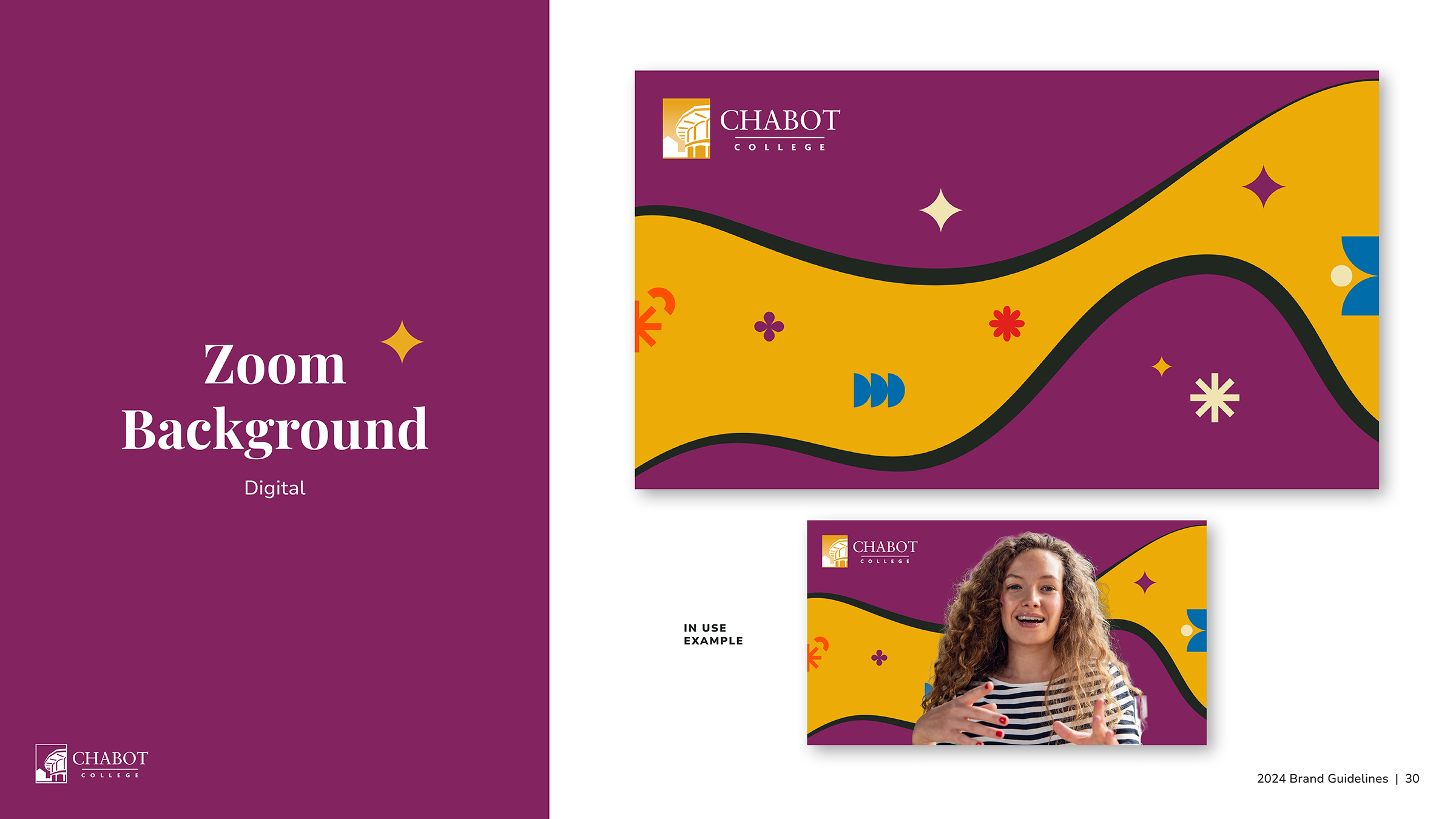

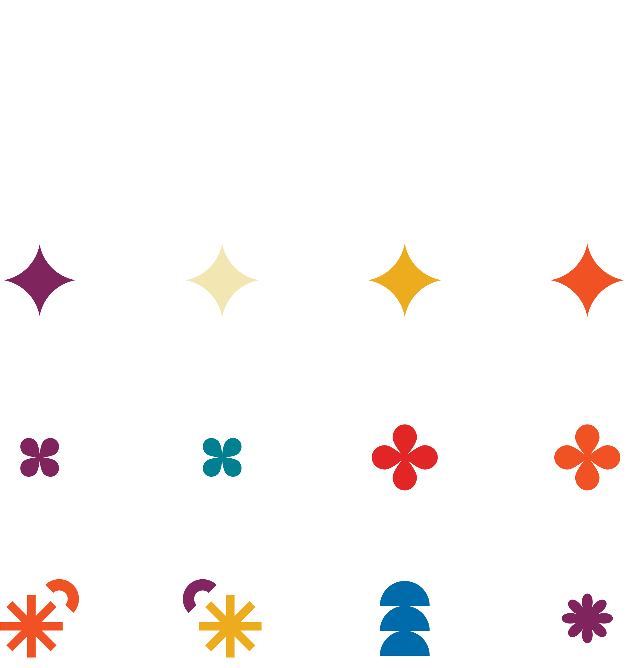
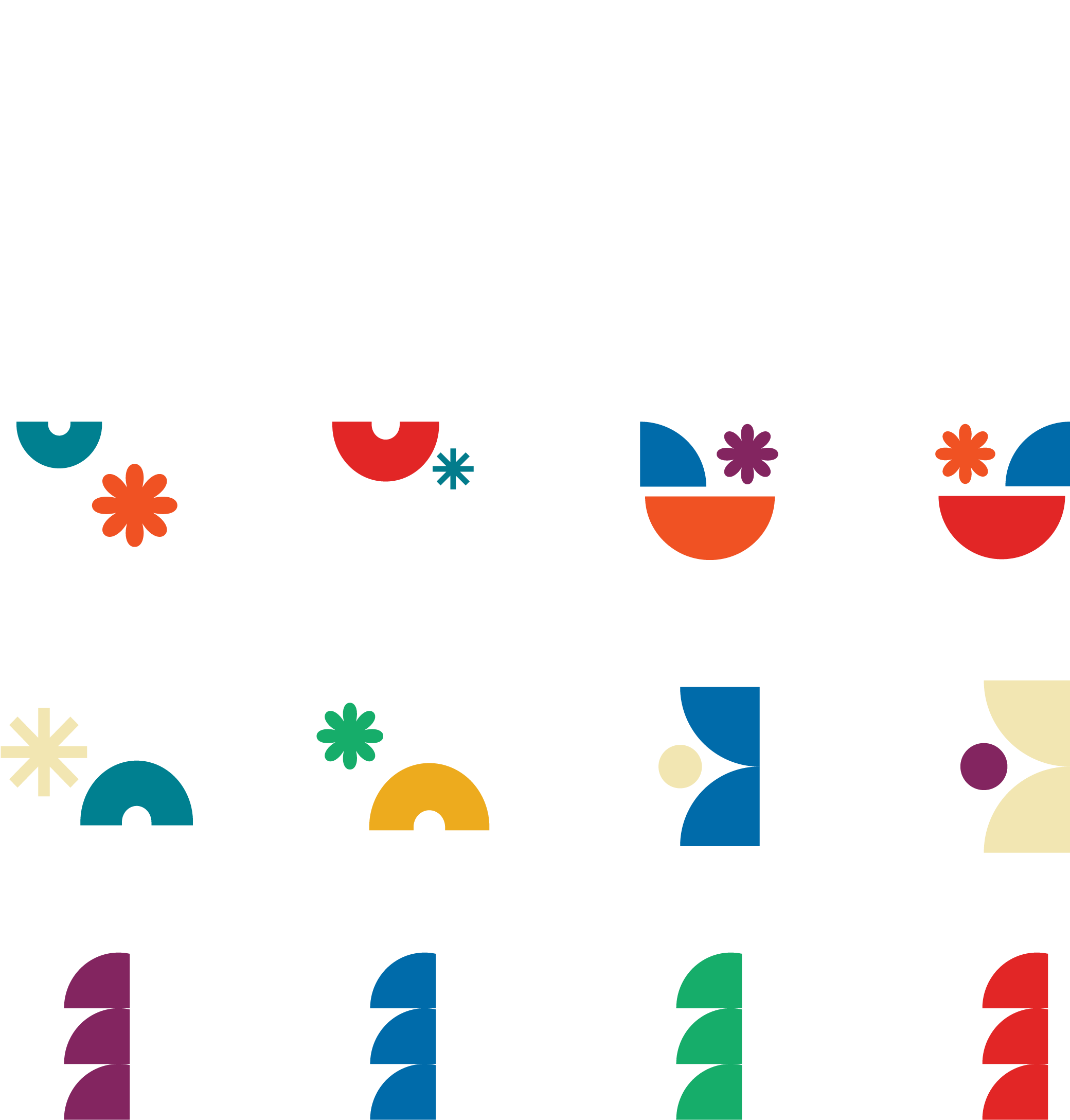
Graphic Elements
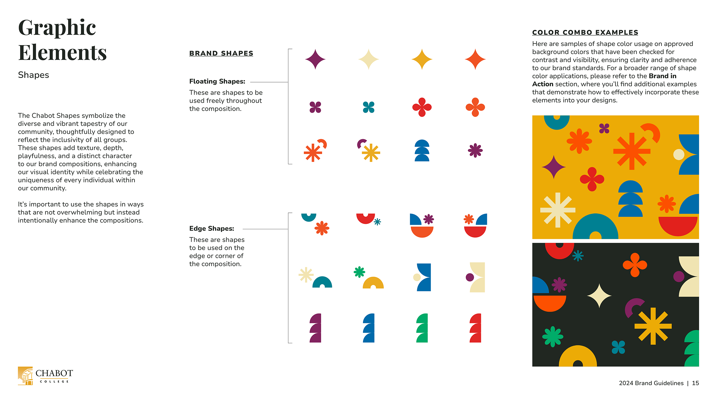
Shapes
The Chabot shapes symbolize the diverse and vibrant tapestry of our community, thoughtfully designed to reflect the inclusivity of all groups. These shapes add texture, depth, playfulness, and a distinct character to our brand compositions, enhancing our visual identity while celebrating the uniqueness of every individual within our community.
It was important to use the shapes in ways that are not overwhelming but instead intentionally enhance the compositions.


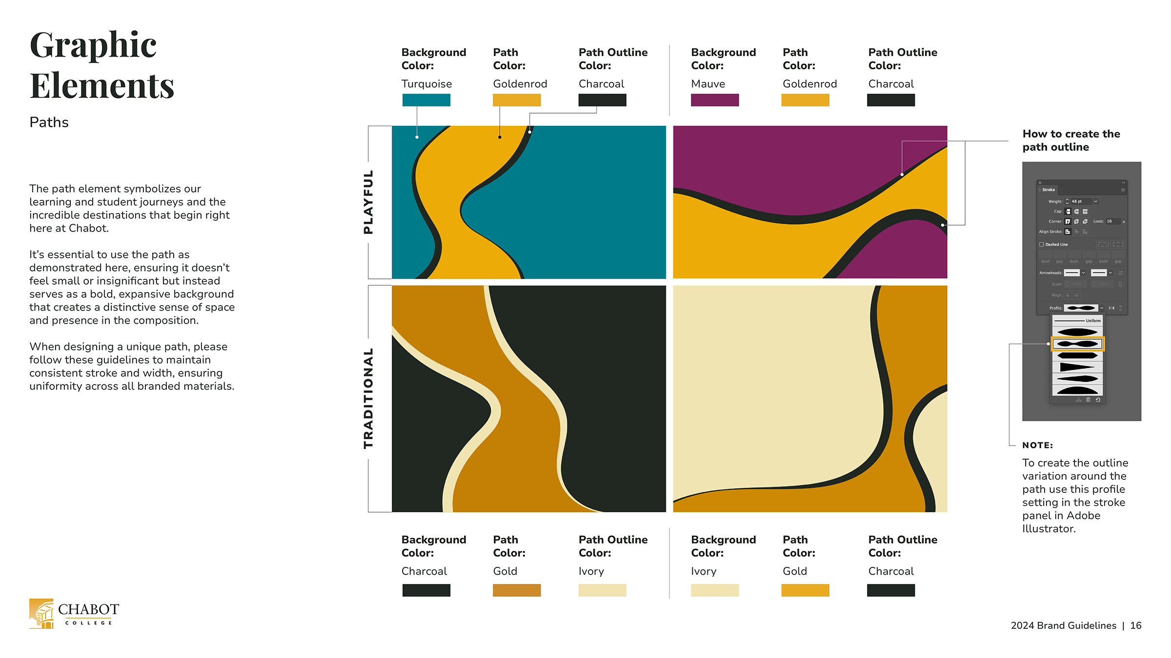
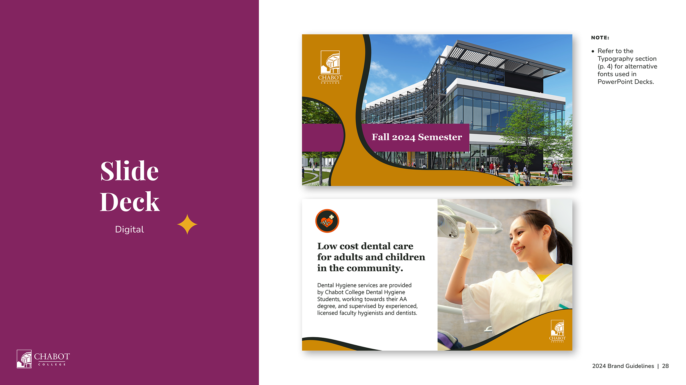
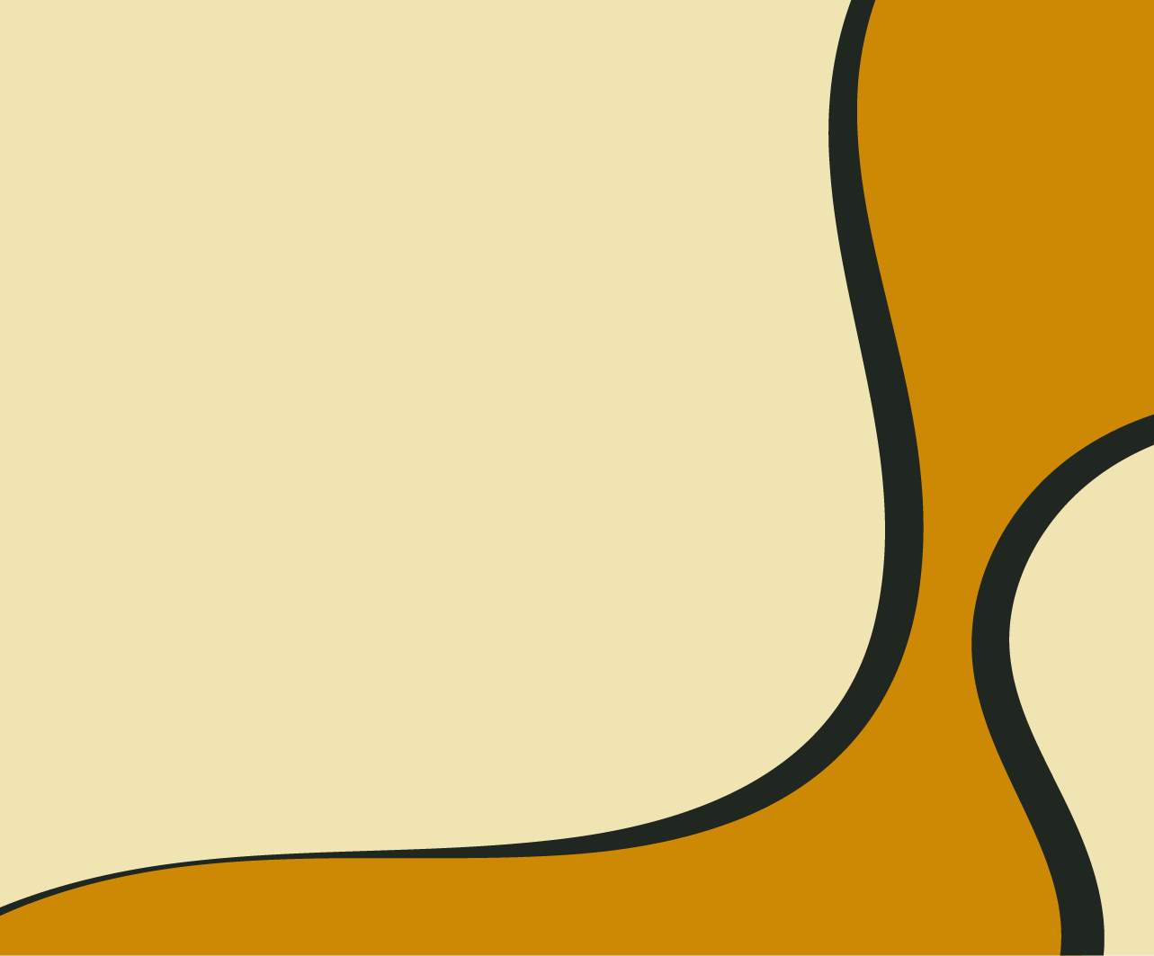
Path backgrounds
The path element symbolizes our learning and student journeys and the incredible destinations that begin right here at Chabot.
It was essential to use the path as demonstrated here, ensuring it didn’t feel small or insignificant but instead served as a bold, expansive background that creates a distinctive sense of space and presence in the composition.
Playful


Traditional

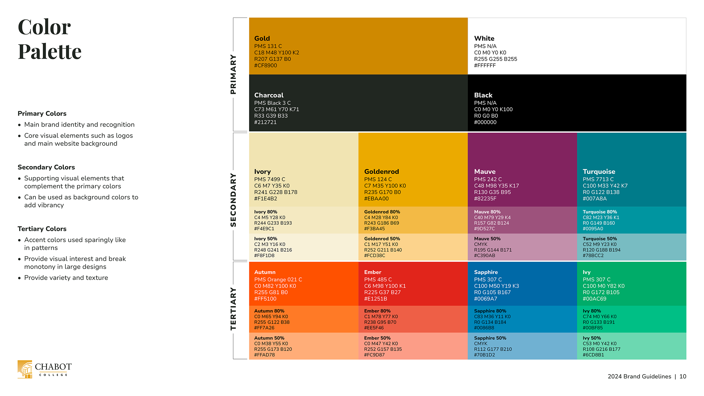
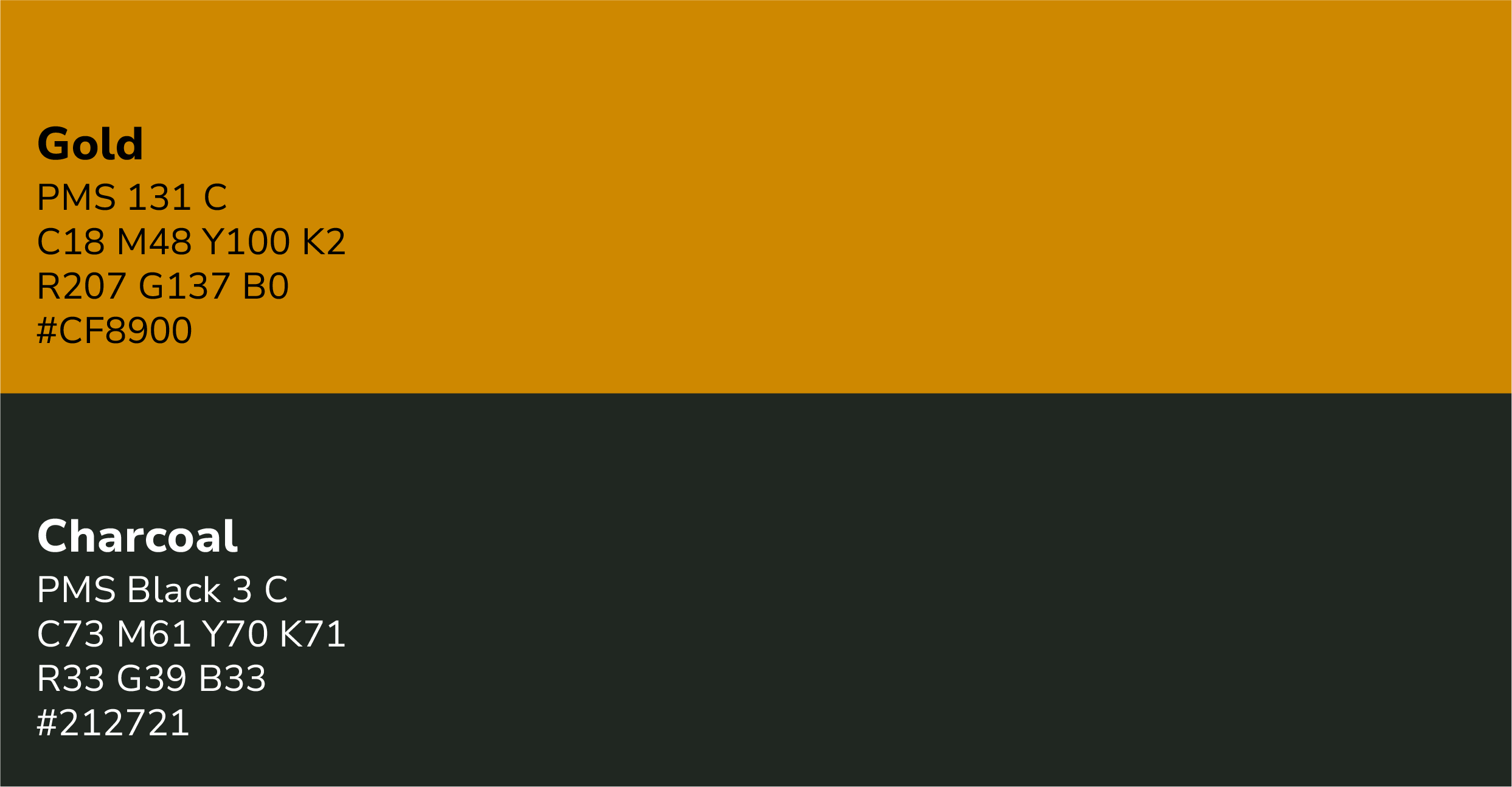
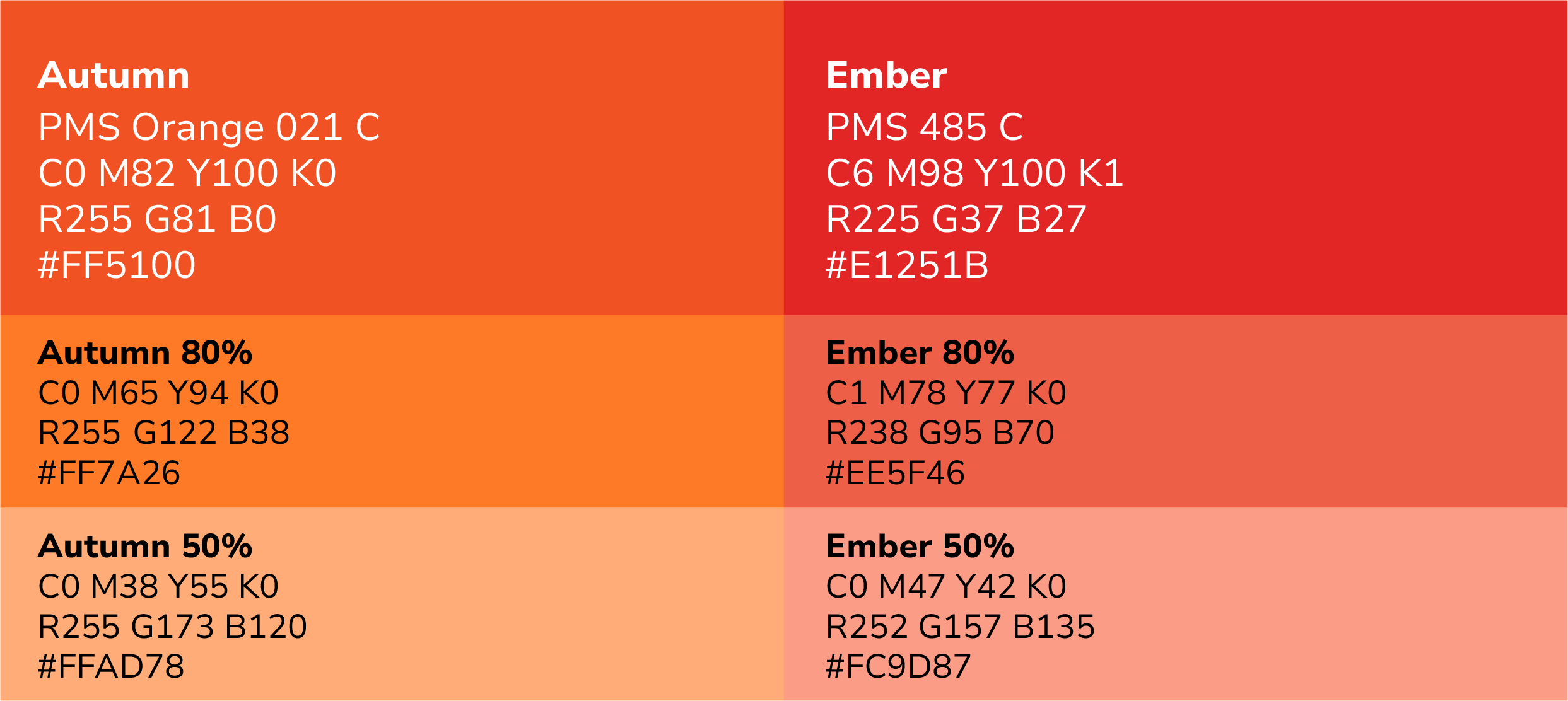
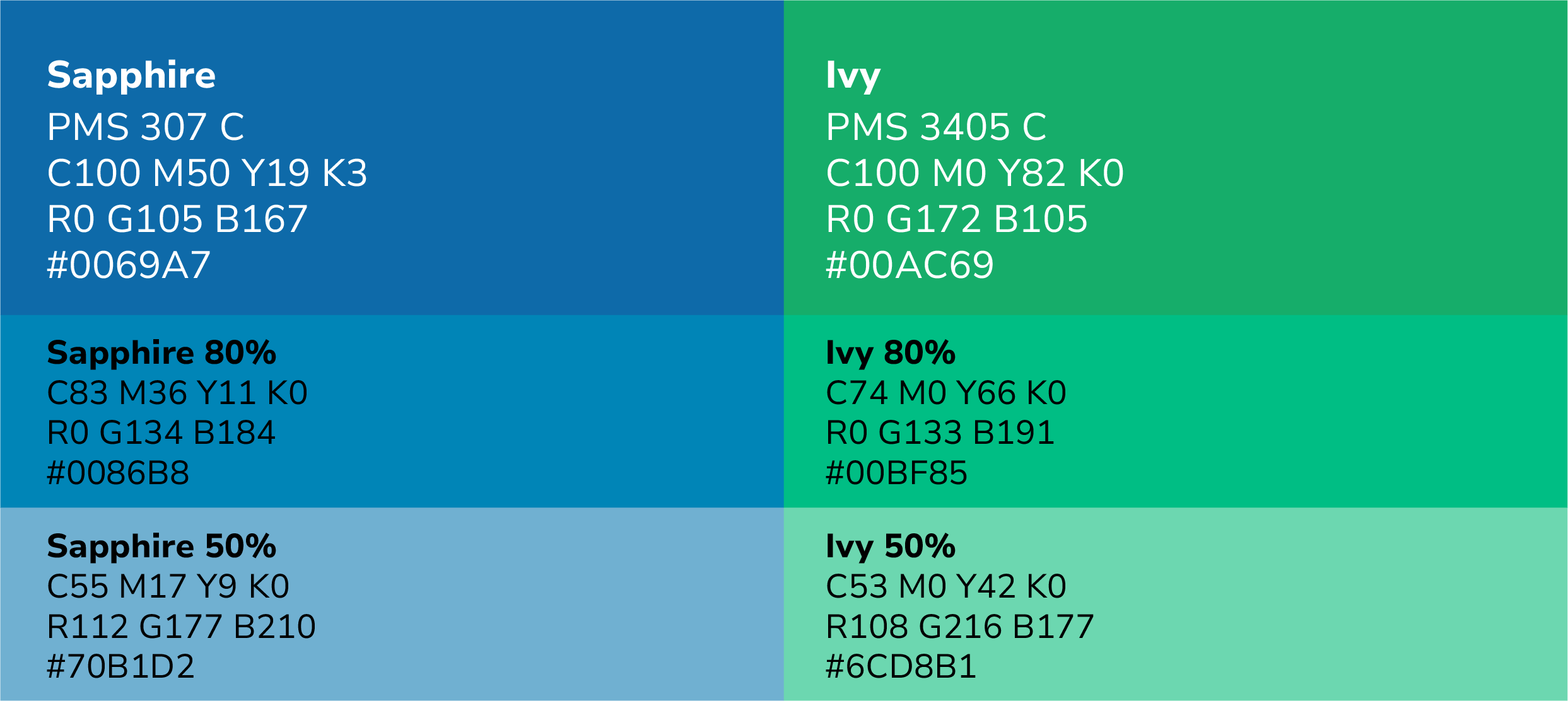
Color palette
Primary
Secondary
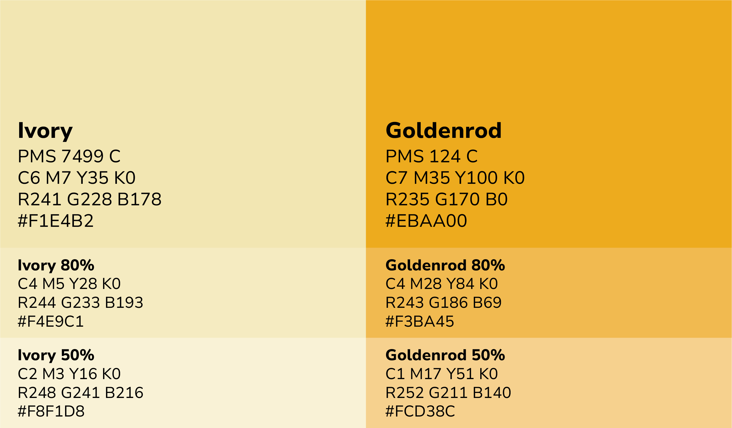
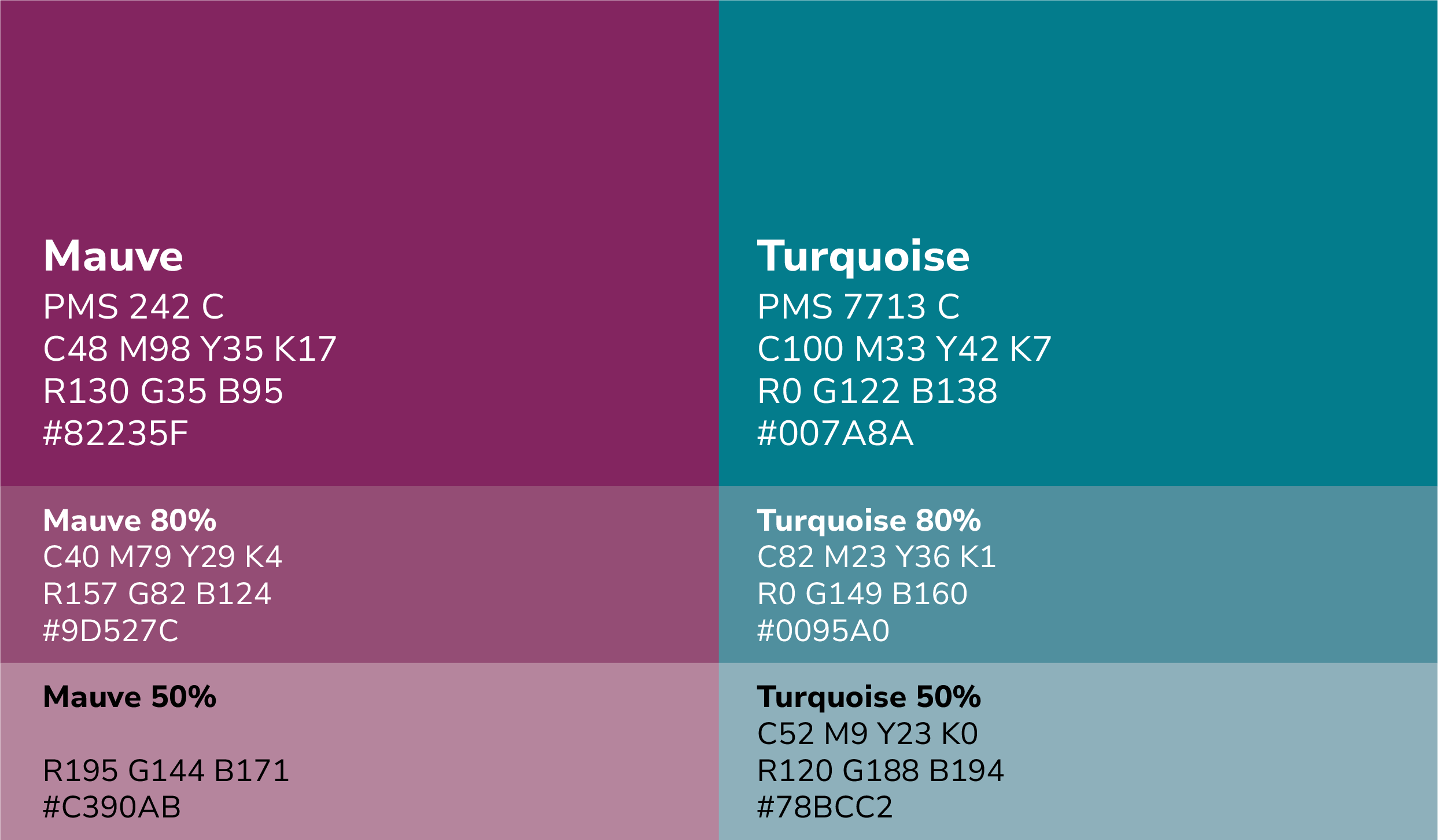
Tertiary
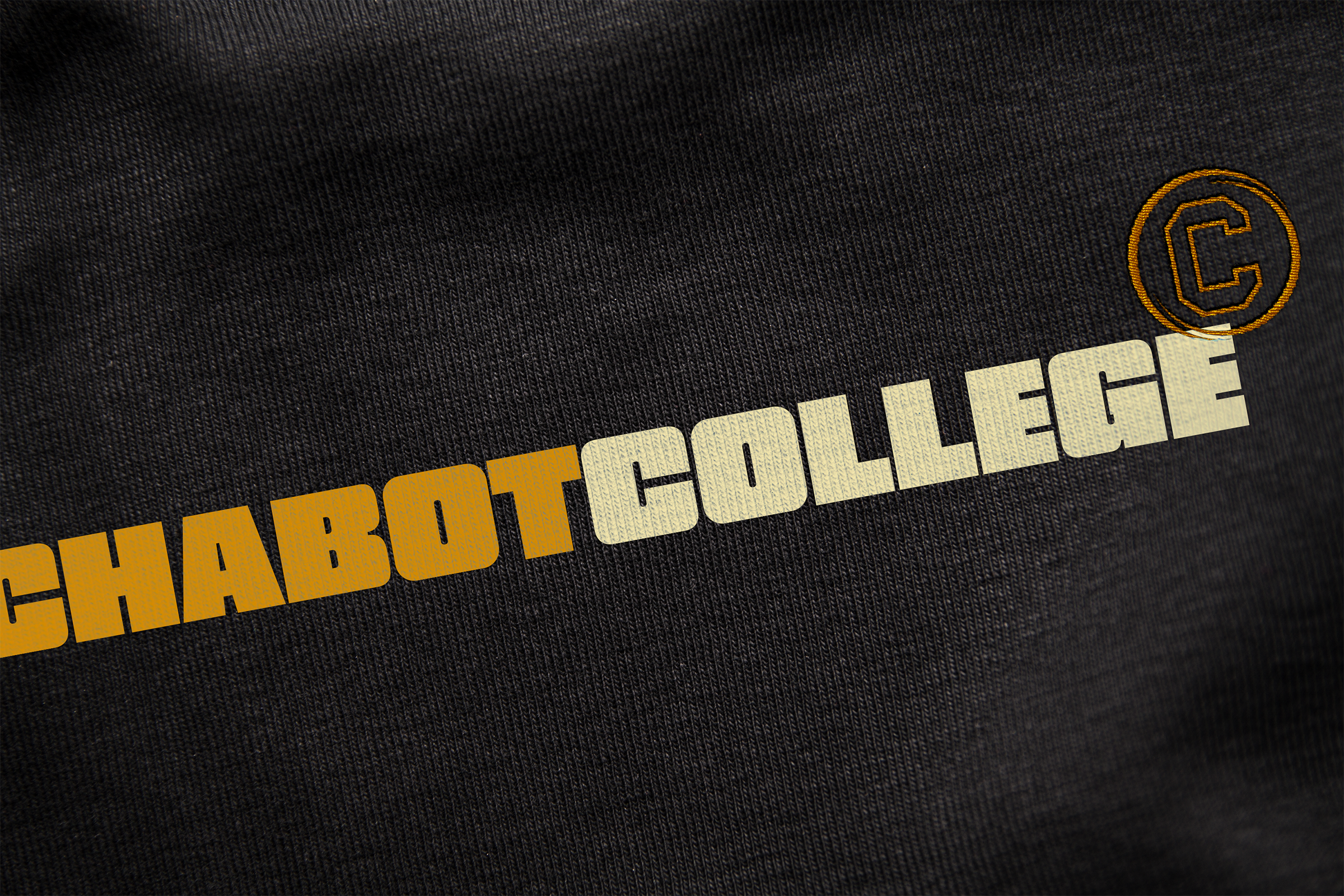
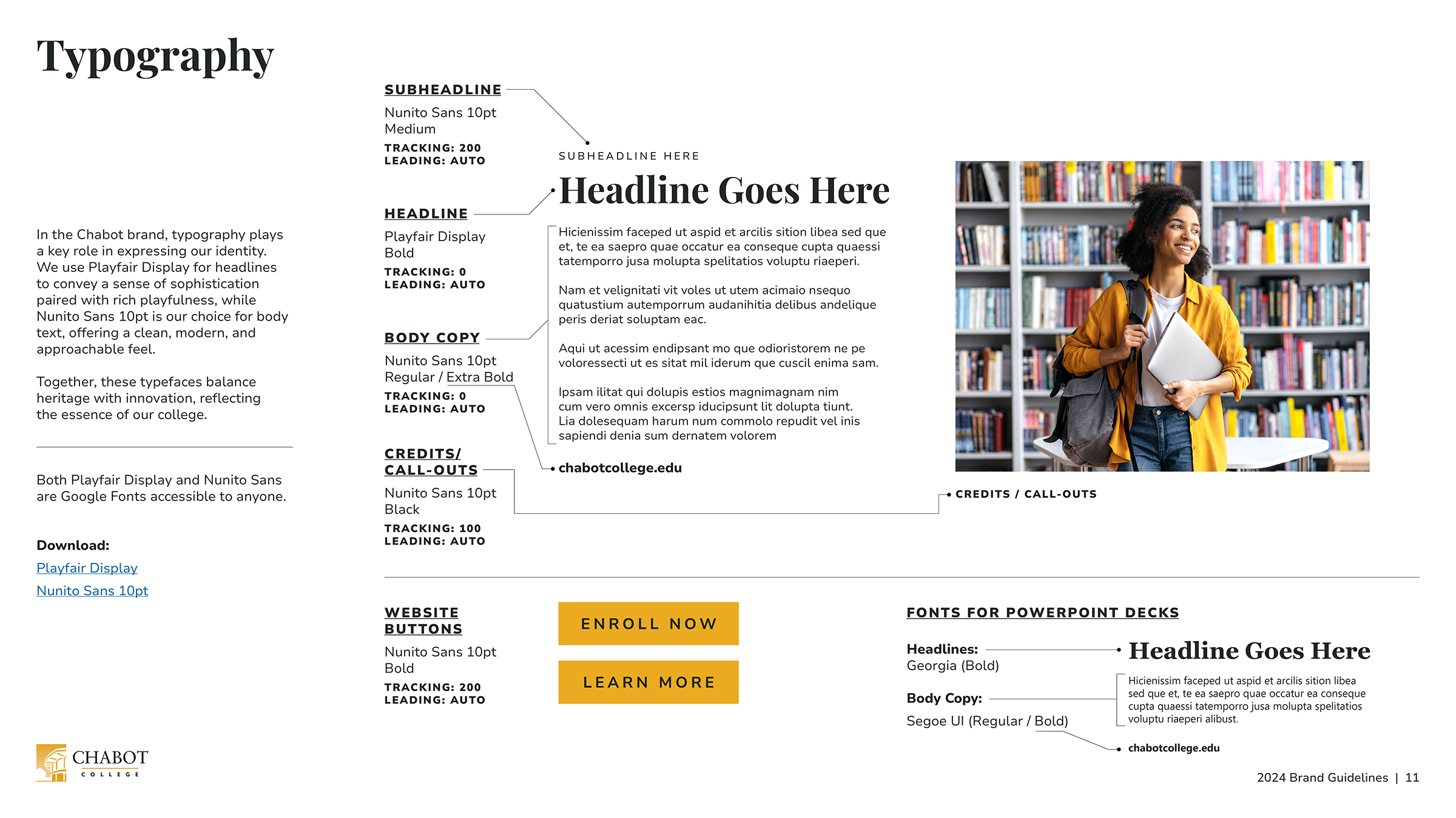
Typography