Fortis
Brand Identity System
Fortis is a commerce and payments platform for software companies. After a series of acquisitions, the brand lacked cohesion, with multiple offerings operating without a unified system. The goal was to bring everything together under a single, clear identity.
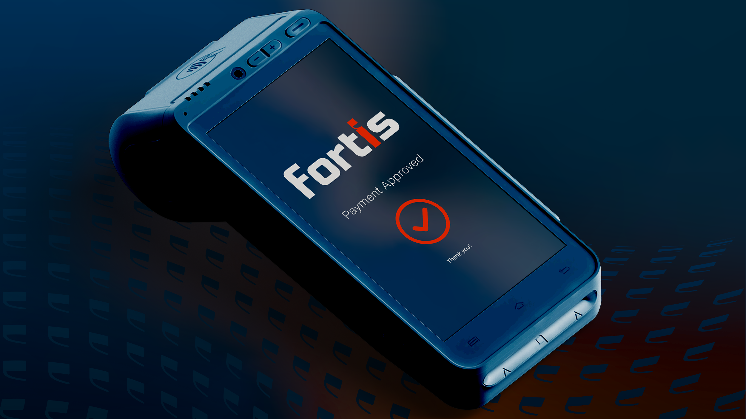
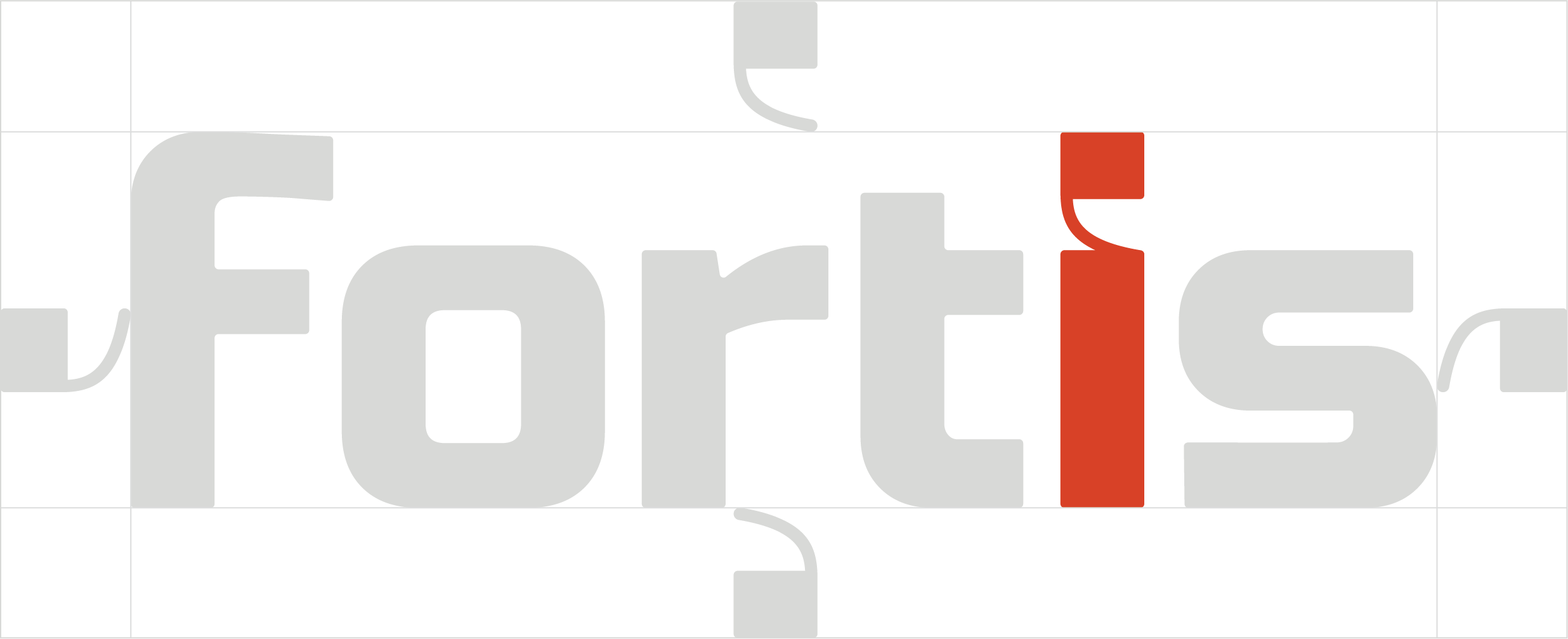
I led the rebrand, developing a flexible system across logo, color, type, illustration, and templates, designed to scale across product, marketing, and partner-facing experiences. The “i” in the logo acts as a connective element and extends throughout the system as a recurring graphic device.
The result is a cohesive brand that simplifies how Fortis communicates and has been widely adopted across the organization.
-
Client: Fortis
Role: Sr. Art Direction, Brand Identity & Design
Year: 2021–2022
-
Credits:
Creative Director: Marissa Fine MarcusPrograms:
Ai, PS
the mark


Logomark Spacing
Clear space is defined by the top of the “i.” This unit sets the minimum spacing around the logo to preserve clarity and prevent interference from surrounding elements.
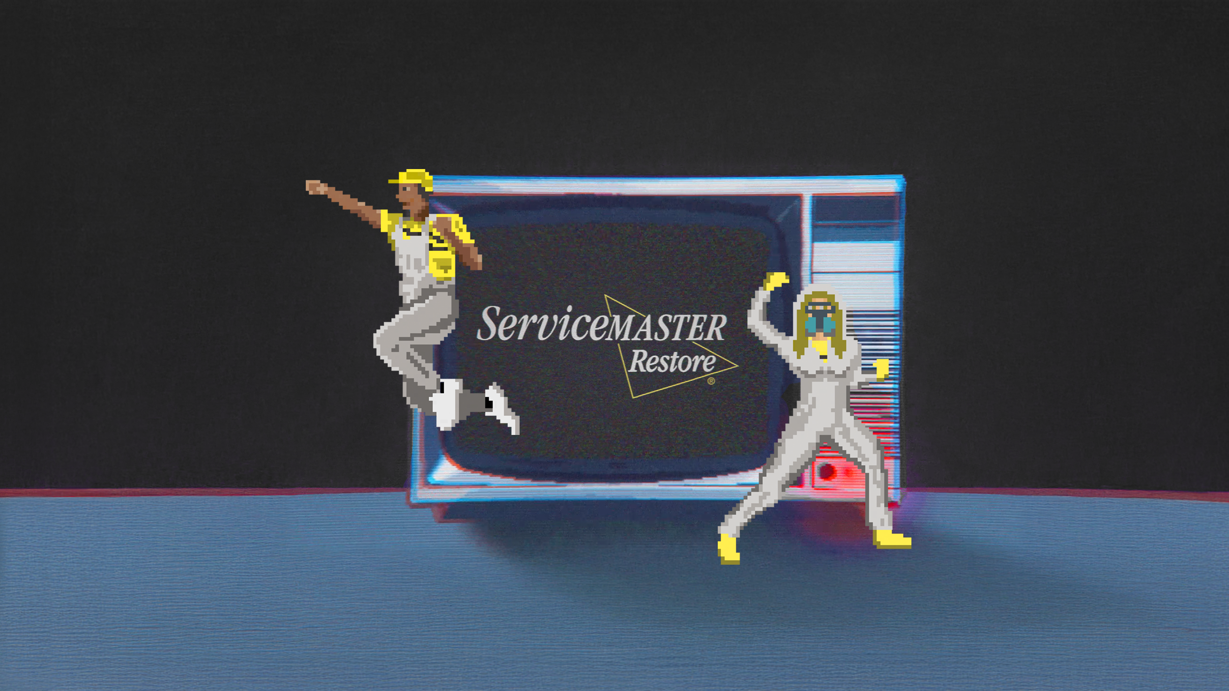
Illustrations


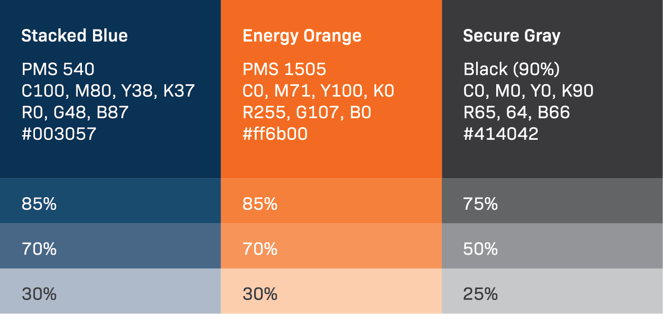
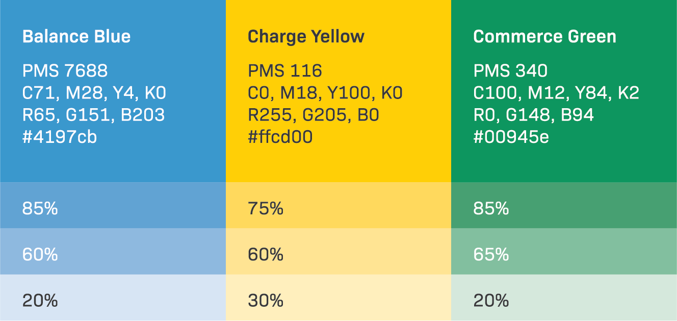
Color palETte
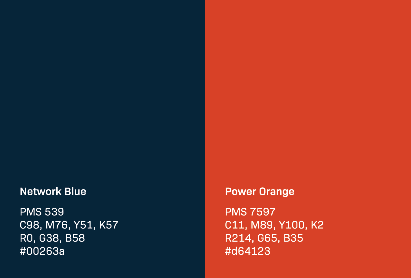
Primary Palette
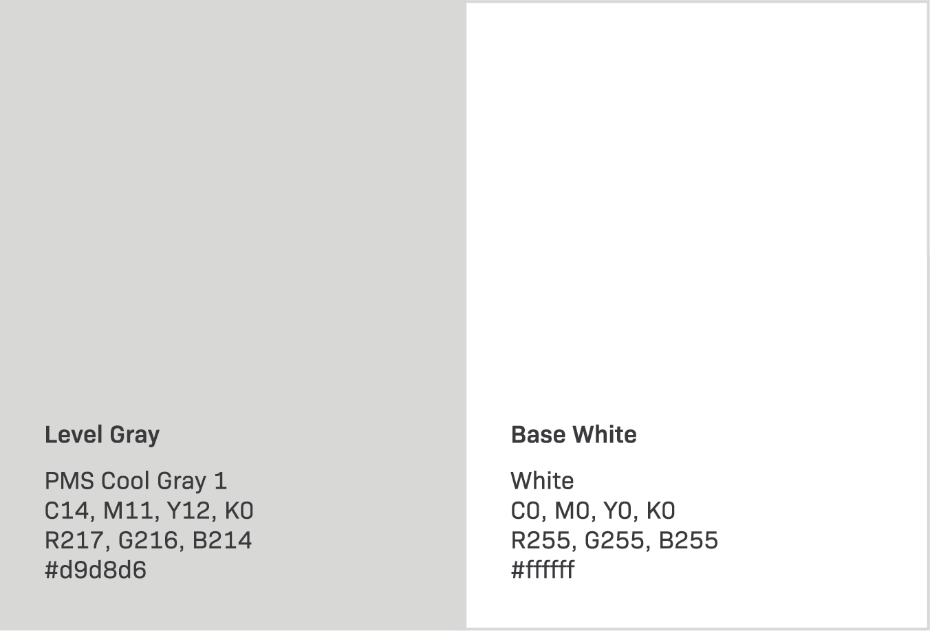
Secondary Palette
Tertiary Palette
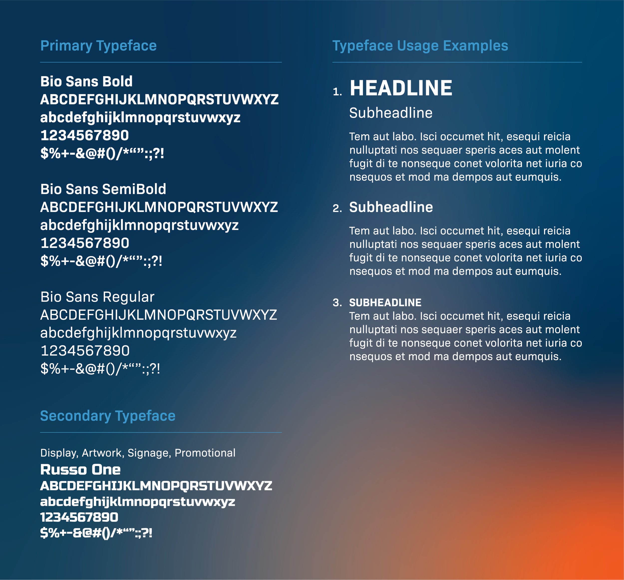
TypogrAPhy