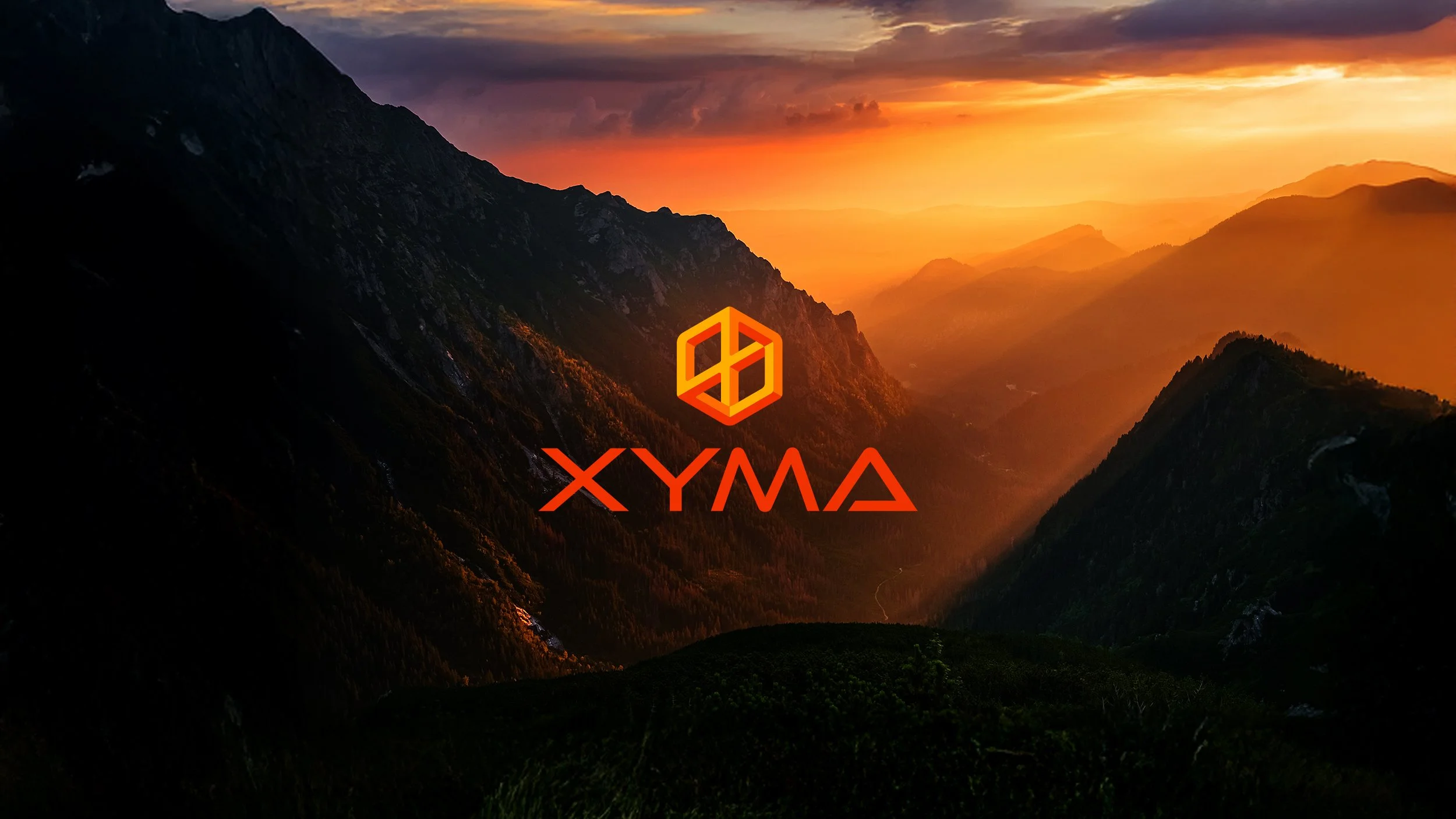
Xyma Industries
Brand Identity
Xyma is a biotechnology and life sciences research consulting company focused on advancing work in genomic engineering, sequencing, and infectious disease diagnostics.
I developed the brand identity from the ground up, creating a system that establishes credibility within a highly technical space while introducing a more visually compelling presence. The goal was to move beyond expected industry aesthetics and create something that feels both precise and distinctive.
The identity is designed to balance clarity with complexity, reflecting the nature of the work while remaining accessible across digital applications.
-
Client: XYMA Industries
Role: Art Direction, Brand Identity & Design
Year: 2023
-
Programs:
AI, PS, ID
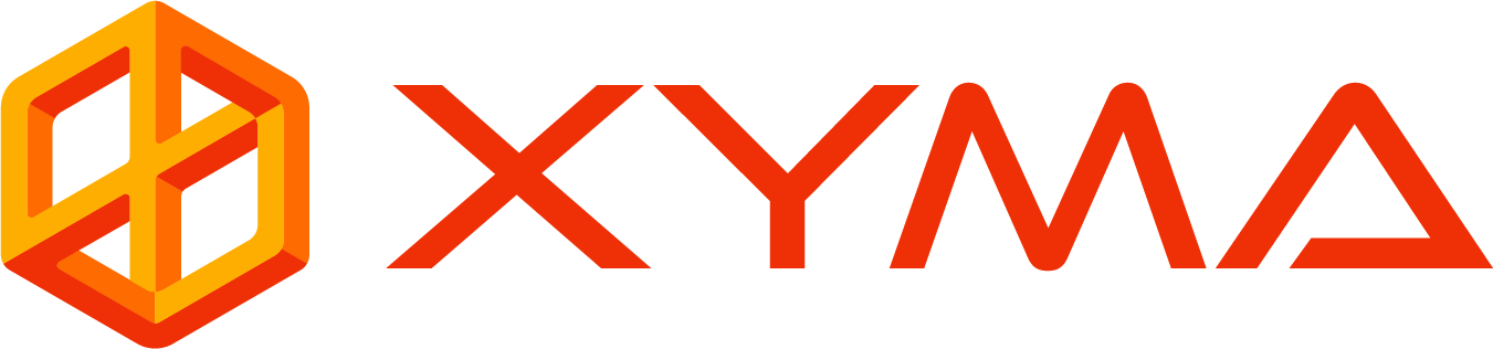
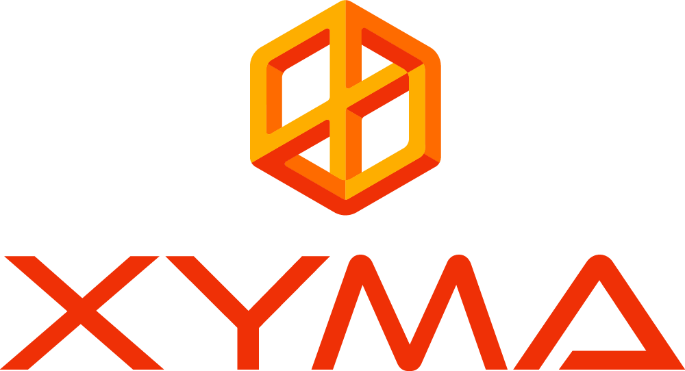
the mark


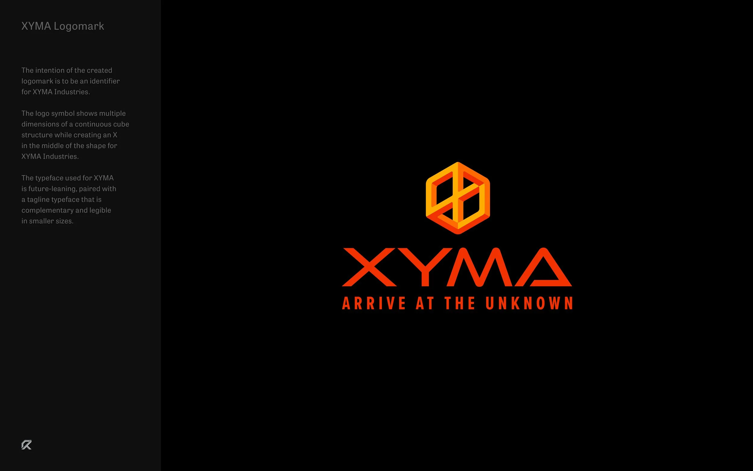
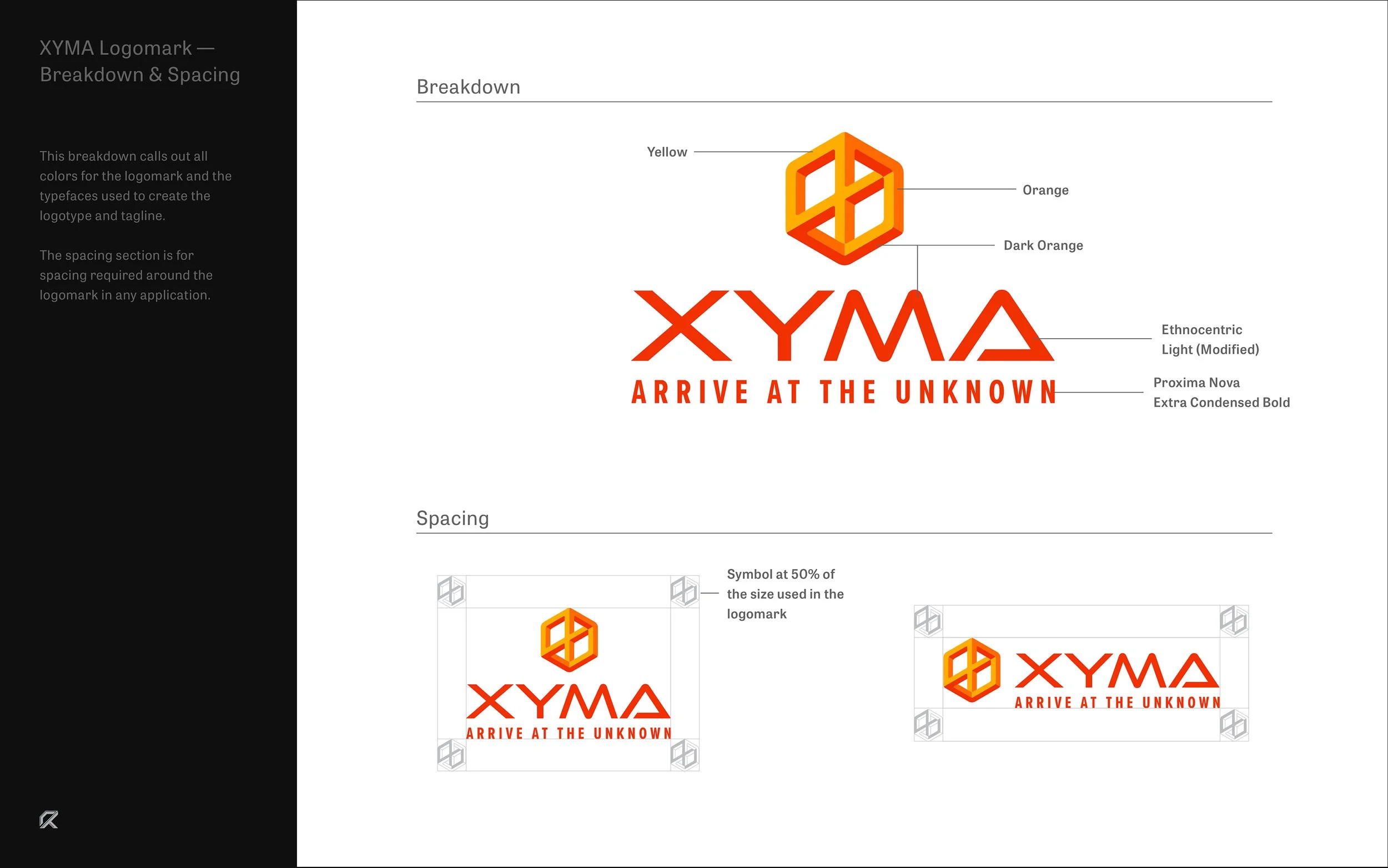

The Symbol
The symbol is built from a continuous cube structure, forming an “X” at its center to represent Xyma. Inspired by M.C. Escher’s impossible cube, it reflects the complexity of scientific discovery while maintaining a clear and recognizable form.
The result is a mark that communicates problem solving and interconnected systems, balancing simplicity with depth in a way that feels both technical and distinctive.
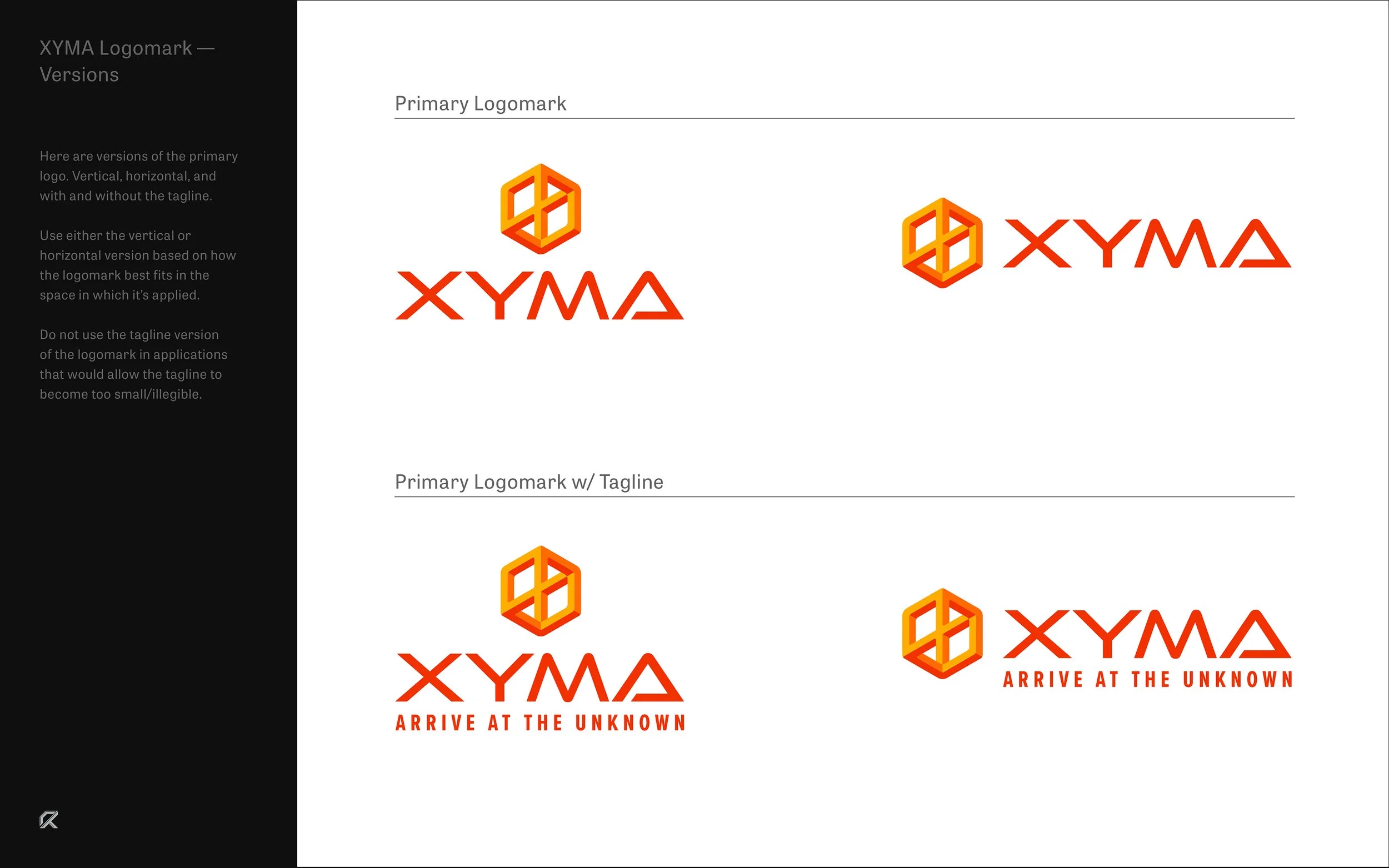
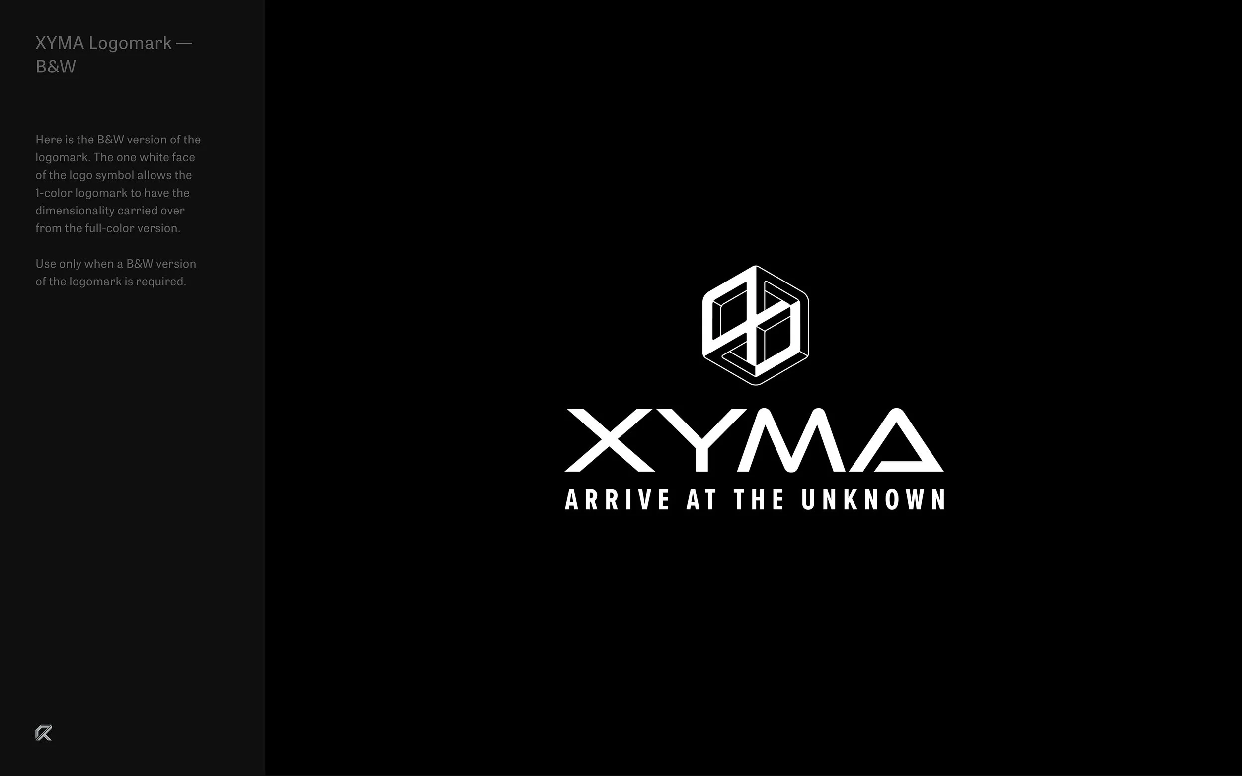
logo varitations

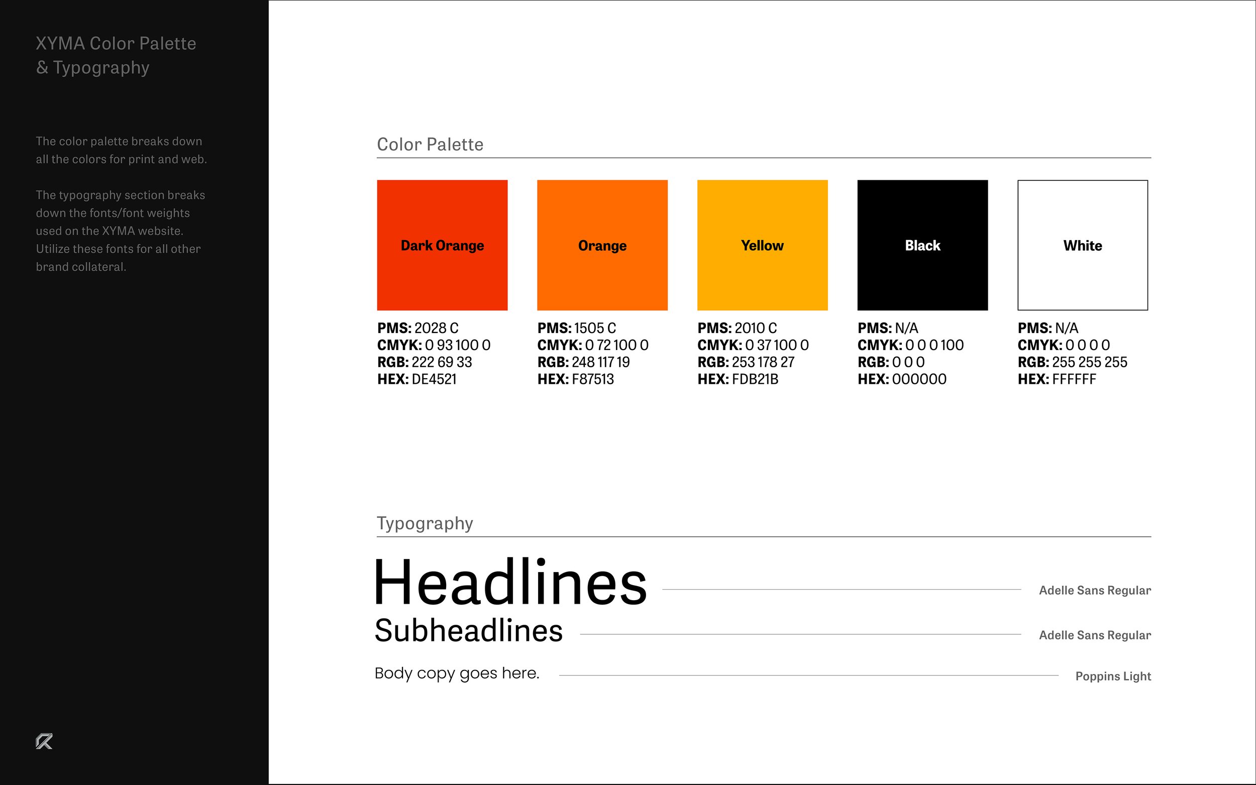
Color palETte


TypogrAPhy
Typeface Pairing
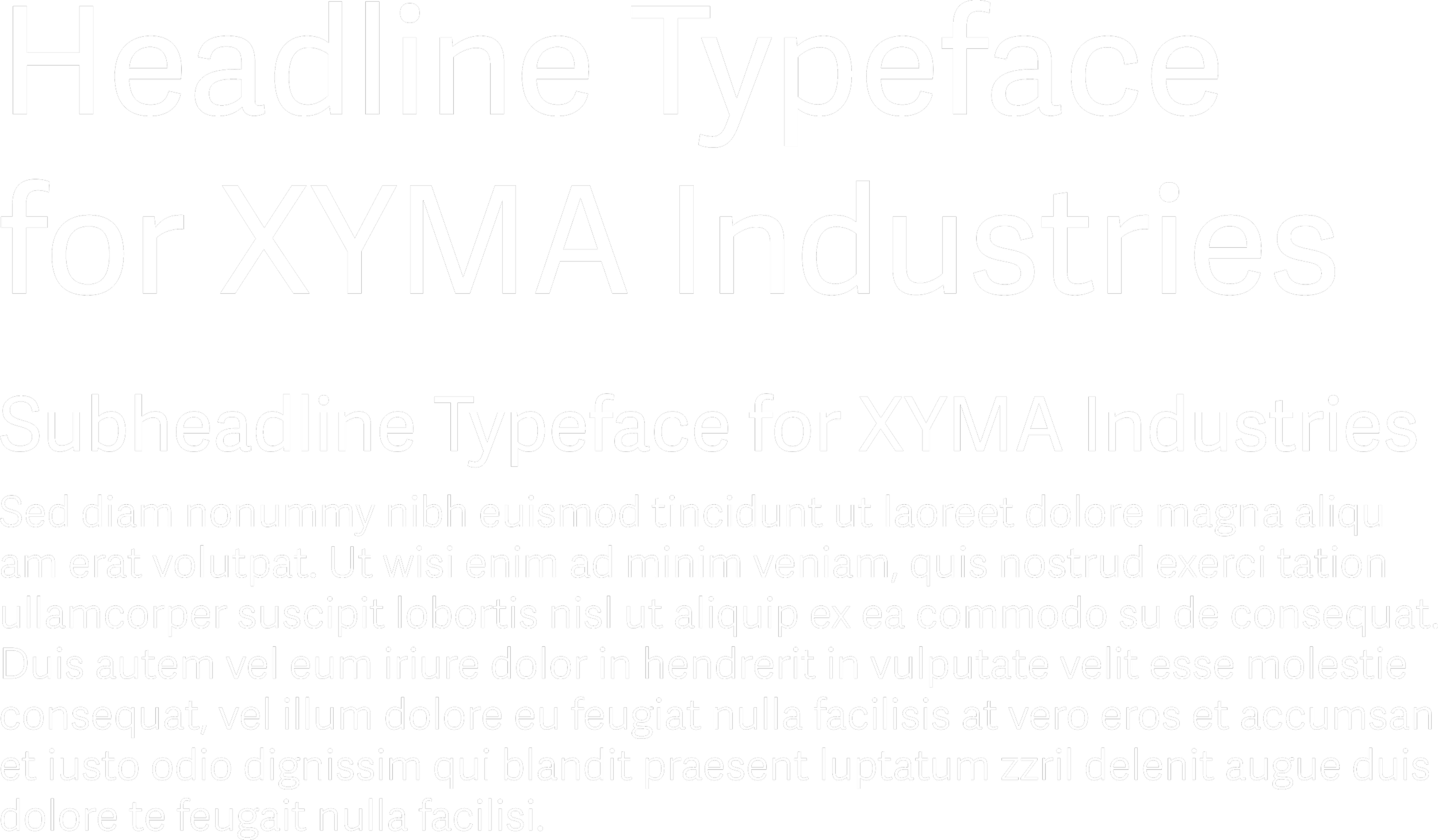
Adelle Sans Regular — XYMA Headlines & Subheadlines
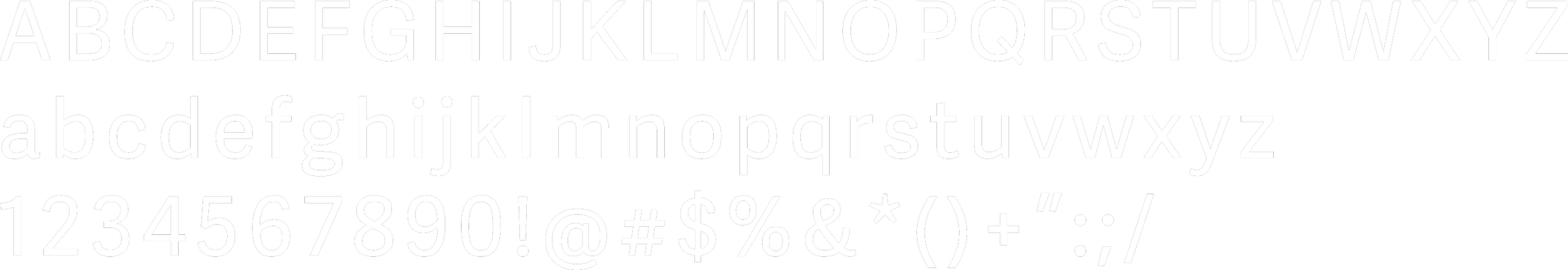
Poppins Light — XYMA Body Copy